40+ Sample Company Brochures
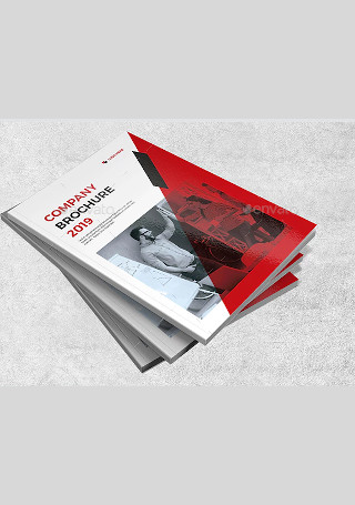
Modern Company Brochure
download now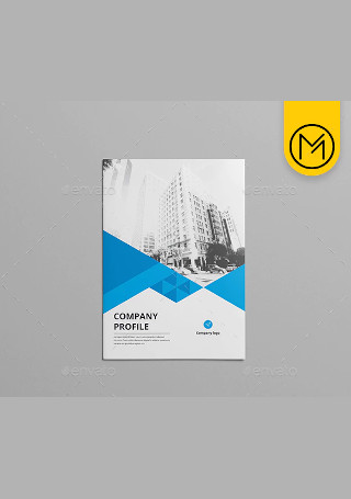
Elegant Company Brochure
download now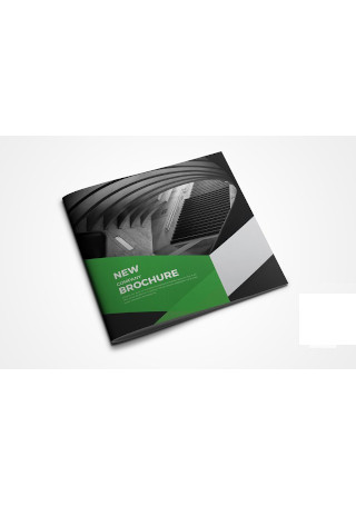
Square Company Profile Brochure
download now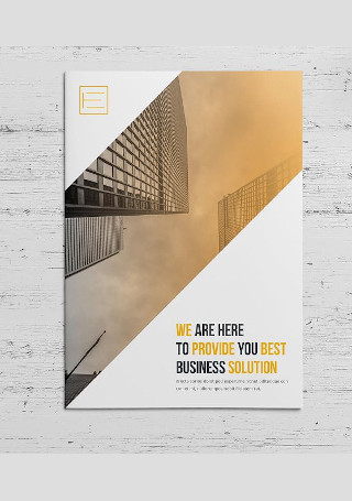
Company Profile Brochure
download now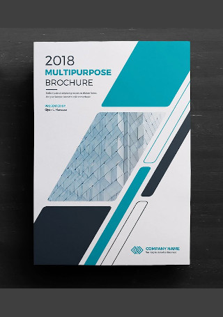
Company Profile Business Brochure
download now
Real Estate Company Brochure Bi Fold
download now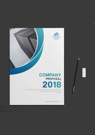
Retro Company Profile Brochure
download now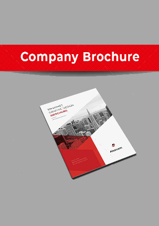
Vintage Company Brochure
download now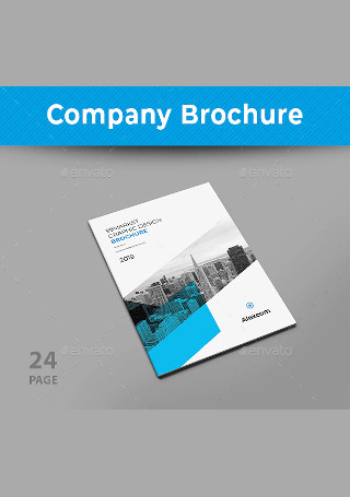
Modern Company Brochure In Design
download now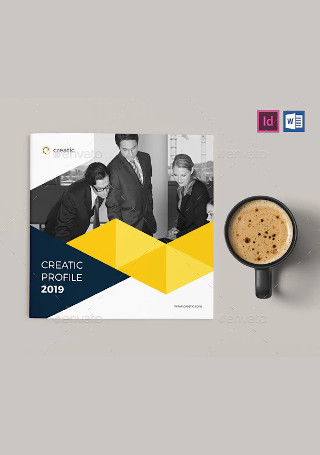
Retro Company Profile Brochure in Vector EPS
download now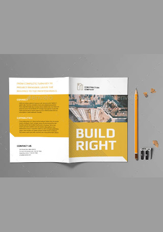
Construction Company Bifold Brochure
download now
Construction Company Brochure Tri-Fold
download now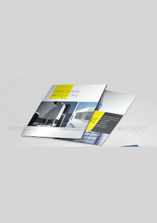
Construction Company Brochure in Vector EPS
download now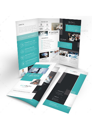
Software Company Trifold Brochure
download now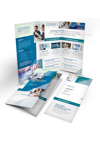
IT – Software Company Trifold Brochure
download now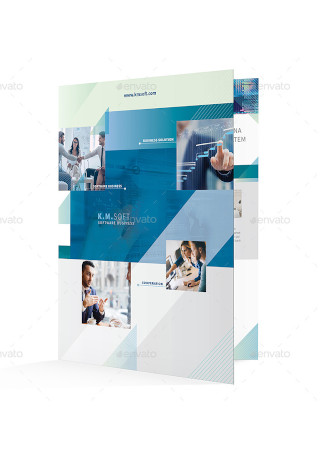
IT – Software Company Bifold Brochure
download now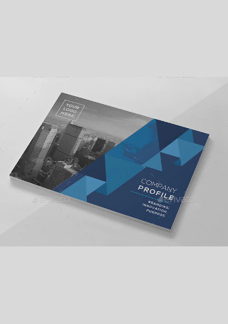
Creative Company Profile Brochure
download now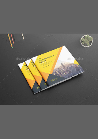
Square Company Profile Brochure in Vector EPS
download now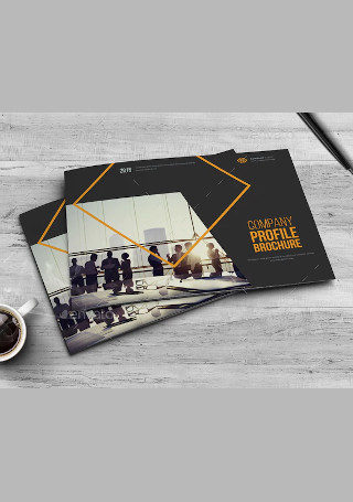
Minimal Company Profile Brochure
download now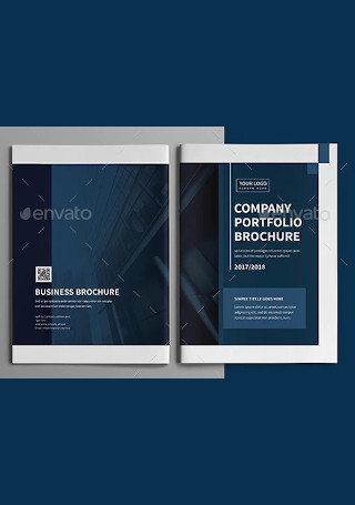
Corporate Company Profile Brochure
download now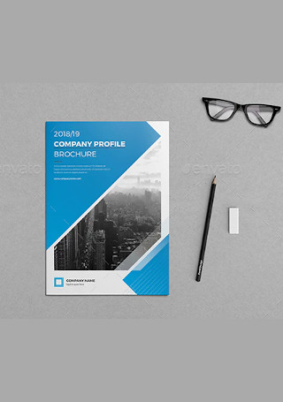
Company Profile Brochure Bundle
download now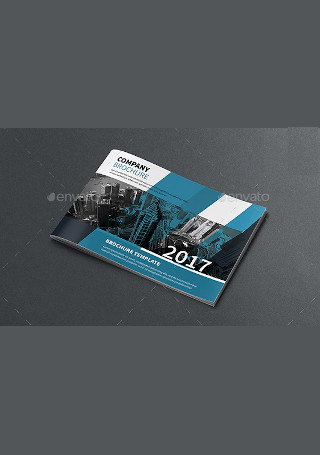
A5 Company Profile Brochure
download now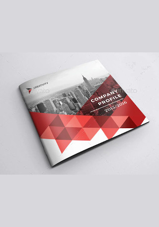
Company Profile Square Brochure
download now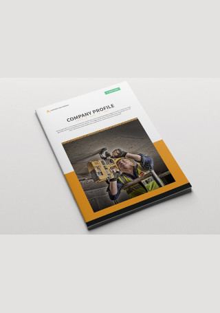
Construction Company Brochure
download now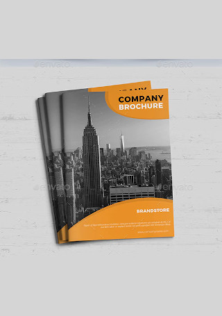
Creative Company Brochure
download now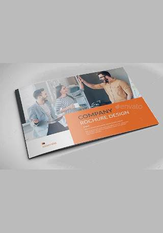
Company Brochure InDesign
download now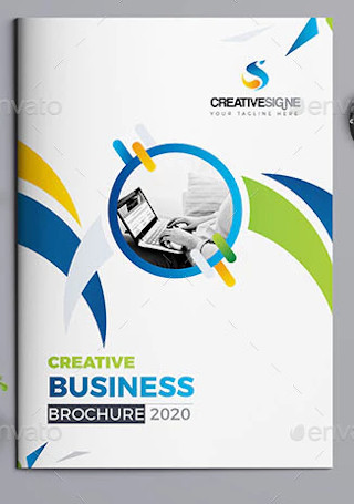
Retro Company Brochure
download now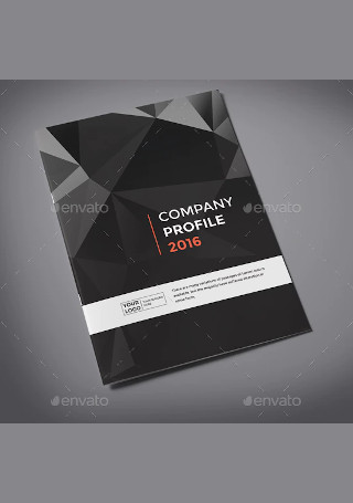
Elegant Company Profile Brochure
download now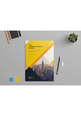
Company Profile Brochure Template InDesign
download now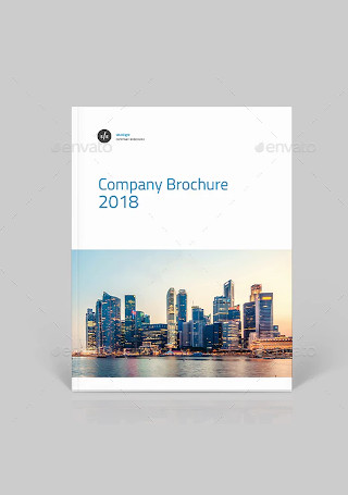
Elegant Company Brochure in Vector EPS
download now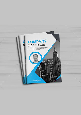
Creative Company Brochure InDesign
download now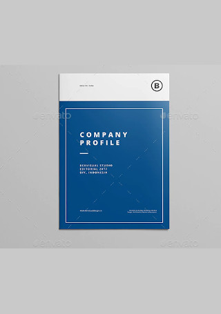
Modern Company Profile Brochure
download now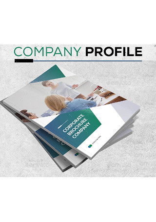
Corporate Company Brochure
download now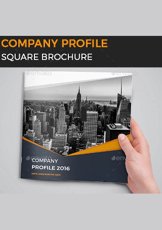
Company Profile Square Brochure in Vector EPS
download now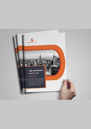
Vintage Company Profile Brochure
download now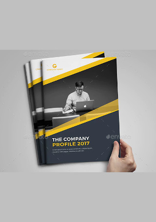
Minimal Company Brochure in Vector EPS
download now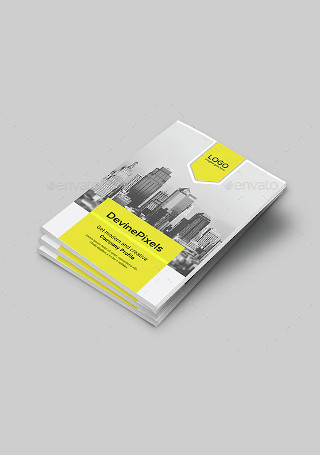
Modern Company Profile Brochure InDesign
download nowFREE Company Brochure s to Download
40+ Sample Company Brochures
Variations of Brochures for Different Companies
Advantages of Developing a Comprehensive Company Brochure
How to Use a Company Brochure for Sales Purposes
Company Brochure as a Tool for Promotion
Types of Announcements Using Company Brochures
How to Make a Visually-Appealing Company Brochure
Tips for Creating an Outstanding Company Brochure
Company Brochure FAQs
Variations of Brochures for Different Companies
A company brochure is a material that is commonly available in a company’s lounge, satellite offices, presentation folders, and booths. Ensuring that a company brochure is readily available can help employees of the business to have something to hand to clients and sales leads whenever they have inquiries about the business or if they want to know more details about the company, its offers, and its operations. There are company brochure variations depending on how a company will use the marketing tool. There is some that focus on the presentation of the culture and history of the business while there are also some that incorporate the marketing and selling of their products and services.
Marketing your company properly with the help of brochures can be very effective if you can look into external and internal factors that can impact the marketing tool’s usage. Aside from the things that you can control, you also need to identify the variables and elements that are out of your hands so you can thoroughly prepare for risks, hazards, and challenges that can with the usage of your company brochure. Hence, it is imperative for you to look at market trends; study the market that you would like to target, and identify marketplace activities that can contribute to the efficiency of your company brochure’s usage.
If you want to begin the processes of company brochure development, we recommend you to browse through our downloadable company brochure templates, samples, and other references. Document guides like the ones listed below can make it easier and faster for you to have a company brochure that can positively impact the marketing condition of your business.
Advantages of Developing a Comprehensive Company Brochure
Your company needs to be known by your desired market so you can get their attention and hopefully their trust and patronage. This is the major reason why it is important for you to create a company brochure. There are actually a lot of other benefits that using a company brochure can give since you can utilize it in a lot of ways. Do you want to familiarize yourself with the positive impacts of marketing with the help of company brochures? Here are some advantages that a comprehensive company brochure can help your company experience:
How to Use a Company Brochure for Sales Purposes
The way you present your company is a reflection of your standards of quality. If you will create a poorly-developed company brochure, then it can say a lot about how you would like to be seen or perceived by the entities within the marketplace. If you will make a company brochure for the purpose of increasing your sales or bettering your sustainability through great sales performance, then you have to ensure that you will develop a document or a marketing tool that is of high-quality. A few of the ways on how you can use company brochures for sales purposes include the following:
Company Brochure as a Tool for Promotion
When making a company brochure, you have to be mindful of the processes that you will follow as well as the information that you will put together to develop an informative and relevant discussion. As an effective promotional and advertising tool, your company brochure should have an organized presentation flow so you can relay necessary and important information about your company successfully. Since you can use a company brochure as a tool for promotion, you need to make sure that you will do your best with regard to the development of the specified tool’s content and document structure. Some of the ways on how you can efficiently do this are as follows:
Types of Announcements Using Company Brochures
A company brochure is great marketing and advertising tool that you can optimize if you want to get positive perceptions and impressions from your target audience. One of the things that you must highly-consider when making a company brochure is the information that you will disseminate. You have to be particular with the things that you would like to announce so you can draft an informative company brochure and so that you can also think of the best design theme that you can use for the document. To help you become well-guided with regards to this subject matter, here are some types of announcements that are done using company brochures:
How to Make a Visually-Appealing Company Brochure
There are a lot of positive impacts that a company brochure can give to your business. The more that you will look into these effects, the better performance you will have during the creation of the document since you are already aware on how you can benefit from it should it be as effective as you have thought it would be. For you to create the best company brochure for your business, you have to identify the process that can serve as your guide during all the steps of the company brochure’s development. A six-step process that can enable you to make a company brochure that can appeal to your clients, customers, sales leads, and other stakeholders is specified and discussed below.
Tips for Creating an Outstanding Company Brochure
As we have specified in the discussion above, you can create a company brochure for different reasons and purposes. No matter what reference it is that you will use as a guide or whatever process it is that you will follow for the document’s creation, there are some general guidelines that you have to remember so you can maximize the benefits that you can get once you begin the usage of your own company brochure. Some of the things that you have to be aware of as you create an outstanding company brochure include the following:
Company Brochure FAQs
Using a company brochure is an effective way of giving information about your business. Of there are any areas or items of company brochure creation and actual usage that are vague or unclear to you, what you can do is to seek for the answers to your questions and inquiries. You can ask questions to experts and professionals or you can also browse through different reliable references so you can get first-hand information about the subject matters that you would like to clear or have in-depth awareness about. Here are some questions that are frequently and typically asked about company brochures:
How can you align your business objectives with your company brochure?
If you want to align your business objectives with the usage of the company brochure, there are actually three things that you can do. First, study your business plan and see to it that your desired marketing goals can be established with the content that you will include in the company brochure. Second, be aware of the current business and marketing conditions of your company so you can use the company brochure to resolve certain marketing issues, problems, and concerns. Lastly, communicate with your team so you can find ways on how you can strengthen the company brochure towards achieving the objectives initially set by the business. If you can do all of these processes, then you can easily come up with a company brochure that is suitable for what your company needs.
What makes a company brochure effective?
Making a company brochure can be easy if you already know the things that you want to present and give focus on. To make your company brochure as effective as possible, you need to have a system to follow for the marketing tool’s development. Follow an efficient company brochure creation guide or procedure so you can ensure that all the steps that can contribute to the quality of your desired output are taken. Aside from this, you also have to consider all the elements that you are working with from the purpose of the company brochure up to the polishing activities that you must take to ensure the effectiveness of the document that you will come up with. The proper development of your own company brochure’s visuals and content is what can make the document truly stand out amidst the different company brochures available out there.
When trying to figure out the ways on how you can develop the company brochure of your business, you have to remember that there are different types of company brochures. Know the specific type of company brochure that you would like to have so you can easily identify the ways on how you can prepare all the materials that are needed for the document’s development. You can also refer to our downloadable company brochure templates and samples so it can be easier for you to develop both the details and layout structure of the company brochure document that you will be making.
