24+ Sample High School Letterhead
-
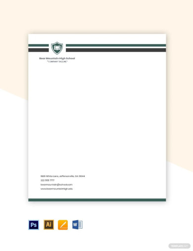
High School Letterhead
download now -

Blank High School Letterhead
download now -
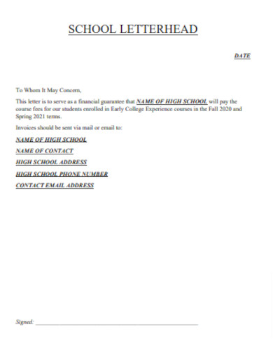
College High School Letterhead
download now -
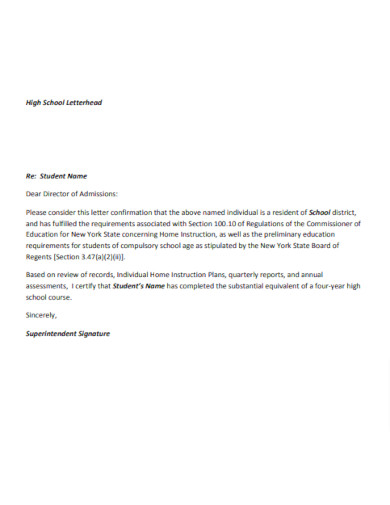
Sample High School Letterhead
download now -
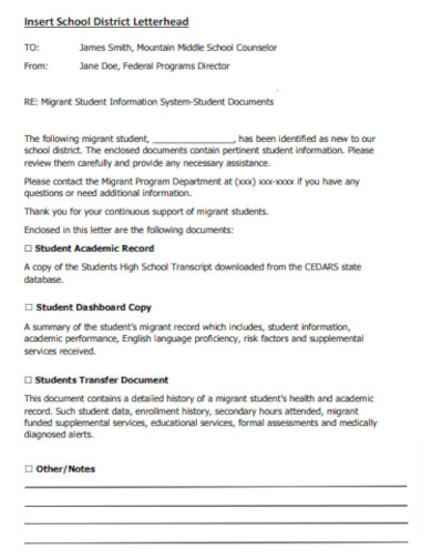
High School District Letterhead
download now -

Printable High School Letterhead
download now -
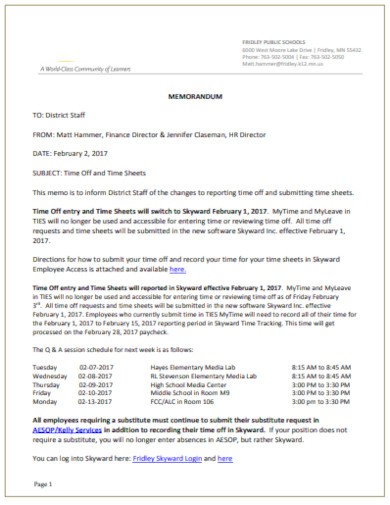
Simple High School Letterhead
download now -
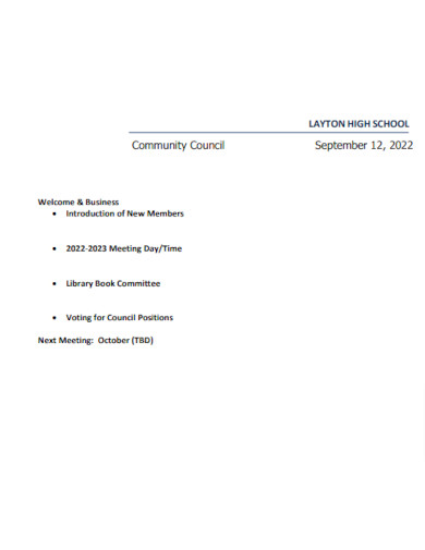
High School Meeting Letterhead
download now -
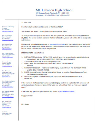
High School Student Letterhead
download now -
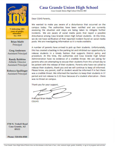
High School Principal Letterhead
download now -
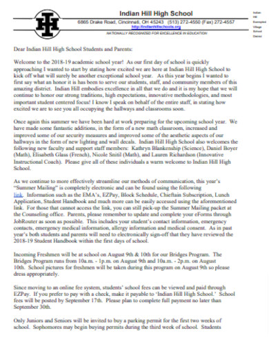
Editable High School Letterhead
download now -
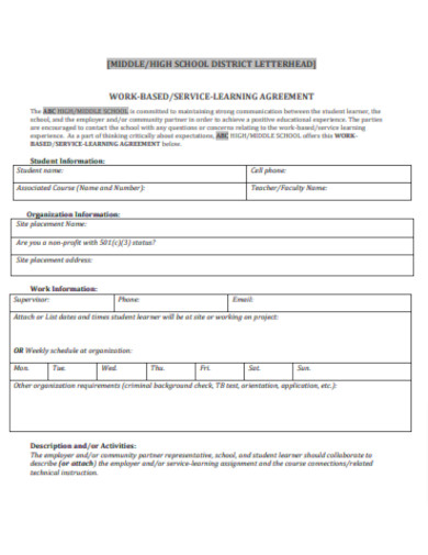
Middle High School Letterhead
download now -
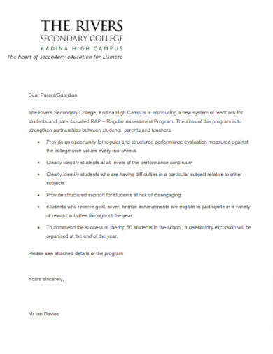
High School Letterhead Outline
download now -
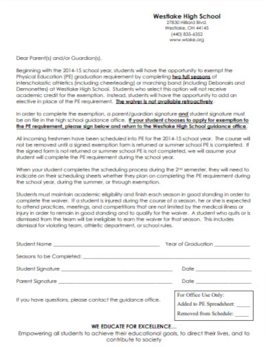
High School Guidance Letterhead
download now -
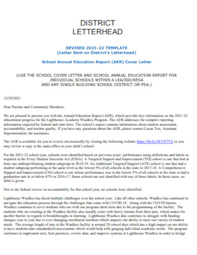
High School Cover Letterhead
download now -
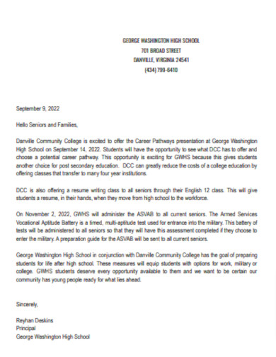
High School Letterhead Layout
download now -
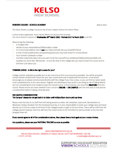
Basic High School Letterhead
download now -

Board of High School Letterhead
download now -
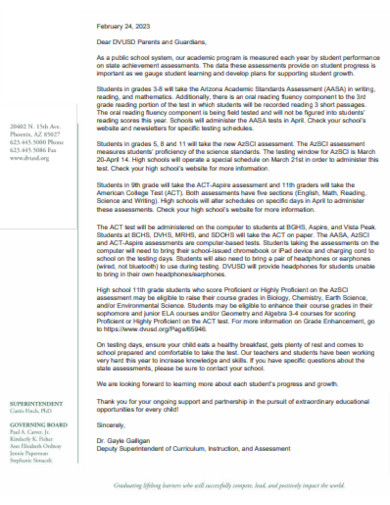
Education High School Letterhead
download now -
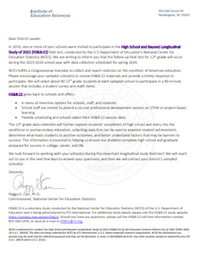
High School College Letterhead
download now -
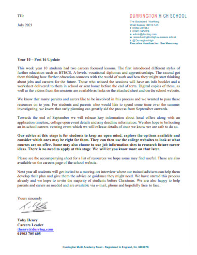
High School Career Letterhead
download now -
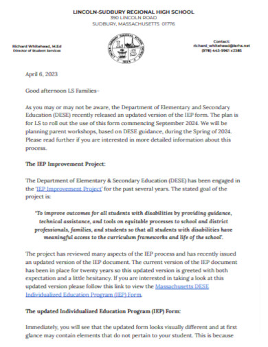
High School Notice Letterhead
download now -
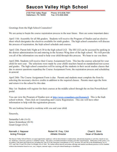
High School Registration Letterhead
download now -
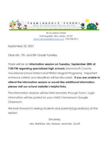
Specialized High School Letterhead
download now -
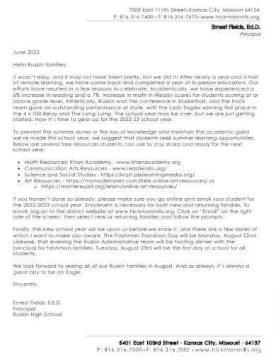
High School Grade Letterhead
download now
FREE High School Letterhead s to Download
24+ Sample High School Letterhead
The Essence of a High School Letterhead
Design Fundamentals
Incorporating Aesthetic Elements
Technological Advancements in Letterhead Design
The Multifaceted Benefits
Can a high school change its letterhead?
Is it legal to use the school’s letterhead for personal use?
How is the design of a letterhead decided?
Are there any standard guidelines for creating a letterhead?
How often should a school update its letterhead?
The Essence of a High School Letterhead
A letterhead is more than just a decorative header on a piece of paper; it’s an emblem of the school’s identity. Comprising elements like the school’s logo, name, motto, and relevant contact details, a letterhead provides immediate recognition and fosters trustworthiness. It emphasizes the school’s legacy, values, and commitment to excellence.
Design Fundamentals
1. Logo and Branding
Central to any letterhead, the school logo should be prominently featured. It’s a visual representation of the school’s ethos and mission.
2. School Name and Motto
Ideally placed adjacent or below the logo, this solidifies the institution’s identity.
3. Contact Information
Vital details like the school’s address, phone number, email, and website are typically aligned to the bottom or top margins.
Incorporating Aesthetic Elements
Aesthetic considerations ensure the letterhead is not just informative but also pleasing to the eye.
1. Color Scheme
Colors should be in line with the school’s official colors, maintaining consistency and brand identity.
2. Typography
The choice of font should be legible, professional, and echo the gravitas of educational institutions.
3. Space Utilization
A balance between design and white space ensures clarity and a streamlined appearance.
Technological Advancements in Letterhead Design
Modern software tools have transformed the design process, allowing for precision, versatility, and creativity. Platforms like Adobe Illustrator or template.net or canva enable intricate designs that can be tailored to fit the school’s unique identity. Moreover, the digital format ensures easy updates, storage, and adaptability.
The Multifaceted Benefits
1. Authenticity
A letterhead lends authenticity to any communication, be it letters, notices, or certificates.
2. Brand Consistency
Regular use reinforces the school’s branding, ensuring it’s instantly recognizable.
3. Professionalism
In interactions with external entities, a well-designed letterhead showcases the school’s commitment to professionalism and excellence.
Can a high school change its letterhead?
Yes, a high school can redesign its letterhead as part of rebranding or modernization efforts. However, changes should be communicated clearly to avoid confusion, and old letterheads should be phased out to maintain consistency.
Is it legal to use the school’s letterhead for personal use?
No. The school’s letterhead is meant for official correspondence only. Unauthorized or personal use can be misleading and may have legal consequences.
How is the design of a letterhead decided?
The design is often a collaborative decision involving school administrators, a design committee, and sometimes professional designers. It usually aligns with the school’s branding and values.
Are there any standard guidelines for creating a letterhead?
While there isn’t a universal standard, it’s essential to ensure legibility, clarity, and consistency. Professional design principles, like maintaining proper margins, using complementary colors, and selecting readable fonts, should be followed.
How often should a school update its letterhead?
While there’s no fixed frequency, updates can occur when there’s a significant change in the school’s branding, contact details, or when the design becomes outdated.
The high school letterhead, although seemingly insignificant, plays a crucial role in the institution’s branding and communication strategy. It goes beyond mere aesthetics and represents the school’s values, legacy, and aspirations. In today’s digital era, the tangible authenticity it offers is both reassuring and invaluable.
