18+ SAMPLE Heuristic Usability Evaluation
-
Heuristic Evaluation of Mobile Usability
download now -
Heuristic Evaluation Usability of Shopping Application
download now -
Heuristic Evaluation Usability
download now -
Heuristic Evaluation Usability for Web Application
download now -
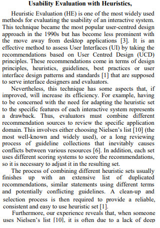
Usability Evaluation with Heuristics
download now -
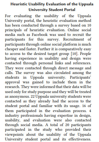
Heuristic Usability Evaluation of University Student Portal
download now -
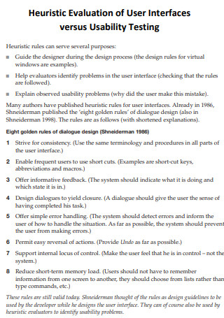
Heuristic Evaluation of User Interfaces versus Usability Testing
download now -
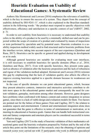
Heuristic Evaluation on Usability of Educational Games
download now -
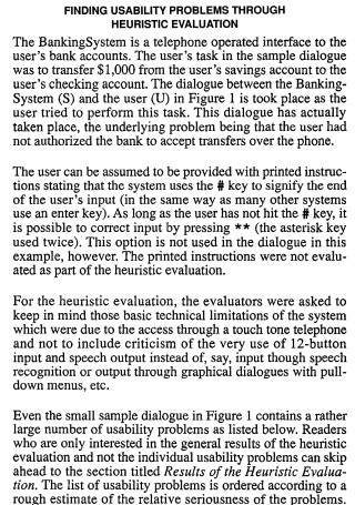
Finding Usability Problems Through Heuristic Evaluation
download now -
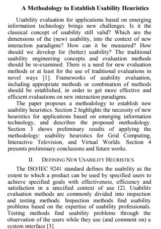
Methodology to Establish Heuristic Evaluation Usability
download now -
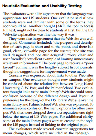
Heuristic Evaluation and Usability Testing
download now -
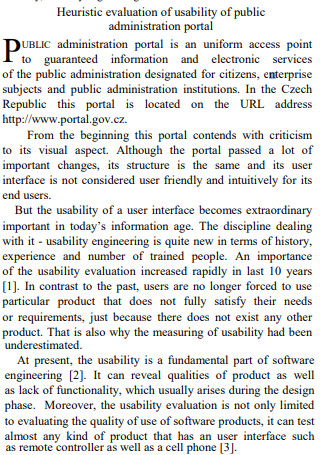
Heuristic Evaluation Usability Public Administration Portal
download now -
Heuristic Evaluation Usability Of Online Enrolment System
download now -
Heuristic Evaluation Usability in Virtual Reality
download now -
Heuristic Evaluation Usability of Mobile Map Applications
download now -
Heuristic Evaluation Usability of Project Evaluation
download now -
Heuristic Evaluation Usabilityof Learning Applications
download now -
Adapting Usability Heuristics to Evaluate Facebook
download now -
Adapting Usability Heuristics of Living Museum Mobile Guide App
download now
FREE Heuristic Usability Evaluation s to Download
18+ SAMPLE Heuristic Usability Evaluation
What Is a Heuristic Usability Evaluation?
What Are the Different Usability Heuristics?
Steps in Conducting a Heuristic Usability Evaluation
FAQs
What is the difference between heuristic evaluation and usability testing?
Do heuristic usability evaluations have their shortcomings?
What is an example of heuristics?
What Is a Heuristic Usability Evaluation?
Before we define what a heuristic usability evaluation is all about, perhaps we should get familiarized with what heuristics are all about. Simply put, any kind of strategy (technique) to analytical thinking or self-discovery that applies a practical method that is not bound to be efficient, perfect, or rational, but is sufficient for achieving an urgent, short-term objective is referred to as a heuristic strategy. Heuristic approaches are designed to be flexible and may be used in coming to rapid conclusions, especially when finding an ideal answer is either impossible or impractical, or when dealing with complicated data. However, having minimal data to deal with in this type of approach can sometimes lead to poor decision-making, which is a disadvantage, but the speed of the process nearly always compensates for this disadvantage.
Since the process of developing an application and designing it usually involves an iterative process, a heuristic usability evaluation will have to be performed. A heuristic evaluation is a usability inspection approach in which one or more usability specialists evaluate the user interface of a product based on a set of established principles known as heuristics. User interface issues discovered during this review will have the potential to be rectified or addressed. This form of evaluation is normally done by a group of people rather than a single person, because it is extremely improbable that one person can notice any user interface flaw in an application, no matter how little it may be. Furthermore, having a team dedicated to this evaluation will aid in the discovery of other issues that can be addressed more quickly and efficiently.
What Are the Different Usability Heuristics?
Listed and discussed below are the different usability heuristics that are used for user interface design, according to a Danish web usability consultant named Jakob Nielsen; Keep in mind that they are identified as heuristics since they are not meant to be strict guidelines, instead, they are to be treated as simple rules of thumb.
Steps in Conducting a Heuristic Usability Evaluation
Now that the heuristic usability evaluation and the corresponding usability heuristics have been discussed, it’s now time to have a look at all the necessary steps that are followed whenever a team decides to conduct a Heuristic Usability Evaluation:
1. Planning Phase
This is the first important step in the entire evaluation process. A clear aim of what is desired to be achieved with the heuristic usability evaluation must be included throughout the planning process. In other words, suitable goals must be established before any inspections are made of the application’s user interface. In addition, during the planning phase, determine what precisely needs to be reviewed and ensure that all specialists engaged are properly educated. The collection of heuristics to be employed and the number of evaluators to be involved are also determined during this step.
2. Selection of Evaluators
After the planning phase, in which the set of heuristics to be used and the number of evaluators are determined, it’s time to proceed to this step, in which the evaluators involved are going to be identified. Make sure to properly pick the evaluators who will be part of the heuristic analysis. Take into account that the evaluators should never be the application’s end-users. Instead, they should be usability specialists with relevant experience in the business type in which the product is used. An evaluator tasked to investigate a point-of-sale system for the restaurant business, for example, should have at least a basic familiarity with restaurant operations.
3. Briefing Phase
After selecting the number of evaluators and who will the evaluators be in the previous steps, it’s time to brief them on what’s going to happen next. Heuristic analysis evaluators should attend briefing sessions since they will learn exactly what they will be doing and covering during their evaluation. The briefing procedure should be regulated to guarantee that all evaluators get the same directives; or else, the evaluators’ evaluations may be biased. Evaluators may be asked to focus on a certain set of activities as part of this brief, but they may also declare which ones they will address depending on their experience and knowledge.
4. Execution Phase
After the briefing phase of the evaluators, this step of the heuristic usability evaluation will follow next. The evaluators will individually go through the target product’s flows and associated interfaces during the execution stage of the heuristic usability evaluation. They will evaluate these factors in light of the established principles, and they will keep track of any issues or areas for improvement. The issue discovered should be noted together with pertinent facts such as the job undertaken, where they met the problem, why it is a problem and potential suggestions for how to remedy it.
5. Reviewing Phase
After the execution stage of the heuristic usability evaluation, this phase will then follow suit. Following the completion of the evaluations, the assigned evaluators should consolidate their results to minimize duplication and develop a list of usability concerns that need to be solved. These problems should be prioritized according to their severity. The findings are frequently done in the form of a report, which includes a description of the assessment process as well as conclusions and recommendations for resolving the issues discovered. The team should devote time to digesting the report, comprehending it (that is, attempting to discover the causes of the concerns identified by the evaluators), and devising a strategy to tackle the findings.
6. Debriefing
After a review of the findings has been completed, a debriefing will then follow, which will also serve as the last step of the heuristic usability evaluation process. The heuristic usability evaluation debriefing session requires collaboration amongst the multiple evaluators to aggregate their results and create a comprehensive list of issues. They should be encouraged to provide potential solutions for all of these concerns as the cooperation progresses, depending on the heuristics they’ve chosen.
FAQs
What is the difference between heuristic evaluation and usability testing?
While both usability testing and heuristic evaluation can be useful in identifying usability issues that may arise in an interface early in the design phase, there is one significant distinction between the two: in heuristic evaluations, the evaluators are not the target users. Additionally, because heuristic evaluators base their assessments on a list of usability best practices, their findings may differ from those of actual users.
Do heuristic usability evaluations have their shortcomings?
Yes, they do. One downside of a heuristic usability evaluation is that it necessitates training because it relies on the knowledge and skill of the evaluators. Furthermore, educating the evaluators or recruiting external evaluators may add to the time and cost of the review. A heuristic usability evaluation also relies on assumptions about what constitutes excellent usability. This is frequently accurate since heuristics are based on research. However, assessments are no substitute for real-world testing. These are suggestions rather than hard and fast regulations, as the name implies.
What is an example of heuristics?
The anchoring and adjustment method is an example of a heuristic technique. Anchoring and adjustment involve starting with a specified goal number or value, known as the anchor, and gradually adjusting that number until it reaches an acceptable value over time. The main issue with this strategy is that if the initial anchor value is not the genuine value, all future modifications will be slanted toward the anchor and far from the actual value.
When software is in its early stages of the development phase, a heuristic usability evaluation can be performed on it in order to make sure that the design teams have the chance to improve how stable it is even if it’s still in its early stages. It comes with its own sets of pros and cons, though depending on the evaluators, they might find that the pros outweigh the cons. In this article, should you require further understanding, there are plenty of sample templates available here for you to have a look at.
