“Over 50% of Millennials pay attention to print ads.” (Source: Medium)
“79% of SME owners said they had already been using flyers as part of their marketing activities.” (Source: Statista)
“Statistics show that as many as 79% of people retain, convey, or at least look at the contents of a flyer or leaflet.” (Source: Tutsplus)
22+ Business Flyer Samples
-
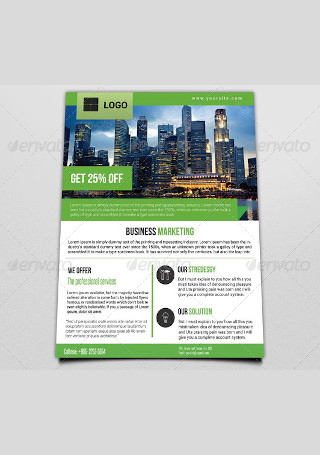
Business Marketing Flyer
-
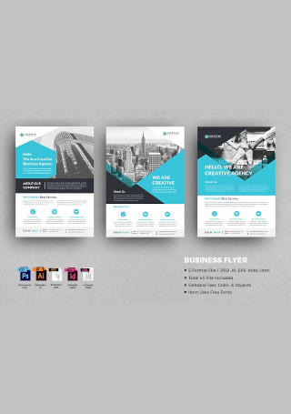
Sample Business Flyer
-
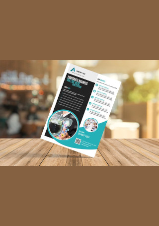
Modern Business Flyer
-
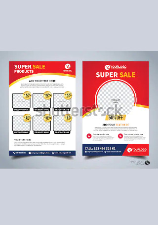
Business Sale Flyer
-
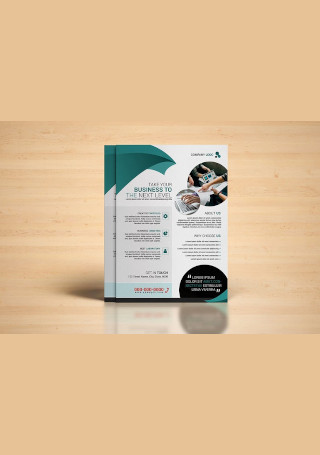
Vintage Business Flyer
-
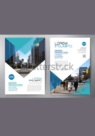
Business Flyer InDesign
-
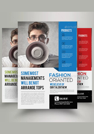
Business Marketing Consultant Flyer
-
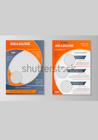
Sample Business Flyer InDesign
-
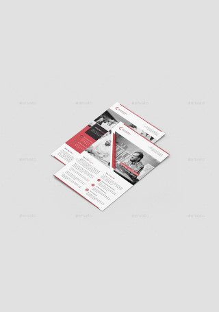
Retro Business Marketing Flyer
-
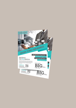
Corporate Business Flyer
-
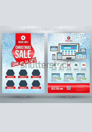
Retro Business Sale Flyer
-
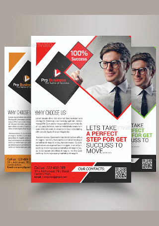
Marketing Consulting Business Flyer InDesign
-
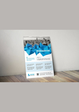
Business Flyer in Vector EPS
-
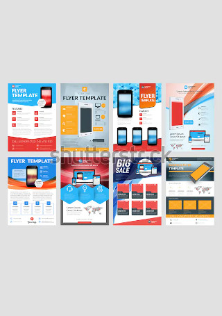
Vintage Business Sale Flyer
-
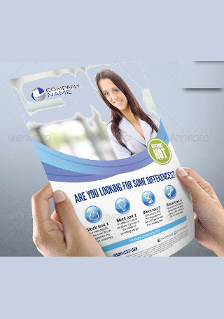
Business Print Flyer
-
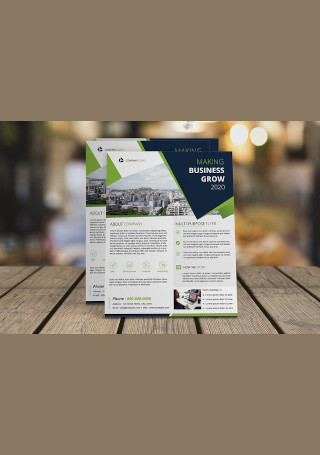
Printable Business Flyer
-
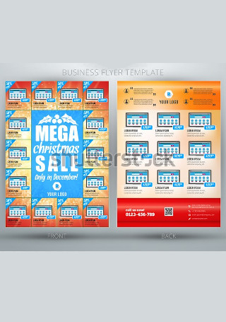
Business Sale Flyer InDesign
-
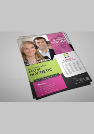
Multipurpose Business Flyer Print Sample
-
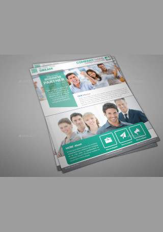
Corporate Business Flyer Print InDesign
-
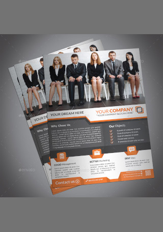
Professional Creative Corporate Business Flyer Print InDesign
-
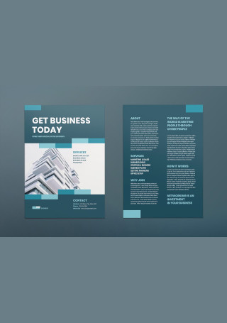
Business Networking Flyer
-
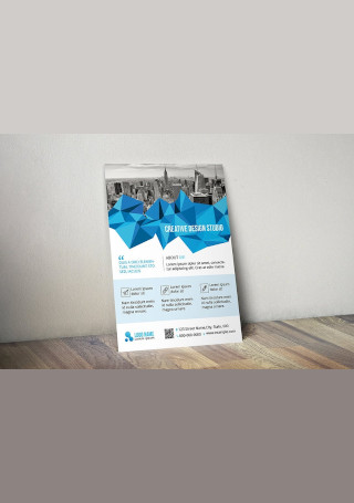
Vintage Business Flyer in Vector EPS
-
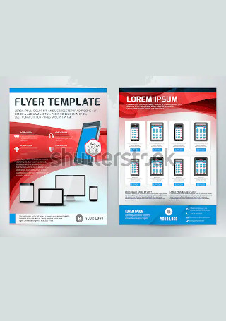
Modern Business Flyer InDesign
What Is a Business Flyer?
A business flyer is a form of paper advertisement intended to deliver information about a product, service, or event to a large audience. Apart from promoting your goods, a business flyer also contributes to the growth of your organization by recruiting new members. One of the best things about a flyer is that most printing services offer big discounts to clients with bulk orders. And because you’ll want to advertise your business to a mass audience, flyers can be a cost-effective means for you to do so. It’s one of the best mediums in print marketing that has helped users generate leads, boost conversions, and increase sales.
Types of Business Flyers
Choosing the kind of flyer to make for your print marketing agenda is entirely up to you. Although these flyer types are designed for a promotional purpose, they usually vary in terms of distribution. Some businesses might use one kind of business flyer for their campaign, or they might choose to use all of them at a time. It’s best to keep your marketing budget and intended audience in mind when deciding on which flyer type to produce.
How to Design an Eye-Catching Flyer
Using flyer printing to advertise your business is an effective means of driving traffic and building brand awareness. You can gain exposure by posting the flyers on walls or handing them out to prospects in targeted locations. But this is also an implication that most of its success depends on the actual design of the flyer. If you’re worried that your business flyer might miss all the right points, we’ve outlined the major components that a highly effective flyer design encompasses.
Step 1: Start with a Compelling Headline
Grabbing the attention of a passing target is far from easy. You need something powerful enough to catch the eye of a reader and encourage them to continue reading. A popping headline is a key ingredient in making a good first impression with your audience. This will stop them from glossing right over your flyer to focus on something else. Not only do you need to create a copy that makes a strong statement, but you also have to be wary about the correct font and positioning of text. You want the headline to stand out even from a fair distance for people to see. With only a few seconds to get a potential customer’s eye, a prominent headline should be your best weapon.
Step 2: Use an Image to Draw Attention
You want to make a business flyer that people can connect with on a personal level. But reading through a flyer filled with blocks of text can sometimes be an eyesore to the average consumer. The best way to make up for it is to incorporate images in your flyer that are lively, relevant, and relatable to your defined market. For professional flyers used in a corporate setting, your best option is to invest in colored print to maintain the resolution of images. While the choice to use stock images would depend on your personal preference, experts highly suggest downloading these images from a unique source.
Step 3: Design Your Layout
It’s only natural to want a business flyer that is visually appealing, but this is not the kind of mindset that can rake in good numbers for your business. The selling factor of a flyer should be your top priority when trying to impress customers with a good layout. Hence, organizing your flyer in a way that sells is essential to generate positive outcomes. The sales angle of your flyer is not something you can afford to cut out, so make sure that your flyer is informational enough to satisfy the needs of your customers.
Step 4: Include a Call-to-Action
What do you want your prospects to do once they finish reading your flyer? Make your call-to-action explicitly clear and position it in a place that customers are sure to notice. It can be the last thing a reader sees or the main takeaway they are bound to keep. A good CTA should persuade prospects to act according to how you want them to for you to generate the desired response.
Step 5: Make Your Contact Information Visible
There’s no point in making a business flyer if readers have no way of getting in contact with you; it’s even worse when your contact information is incorrect. All the hard work you put into designing a formal flyer will go to waste if you fail to include one of the primary elements that customers look for. Whether it’s a phone number, website, or email address, you need to make sure your contact details are made clear and visible for readers to find.
Business Flyer vs. Business Brochure
Flyers and brochures often work hand in hand in conventional advertising. While the two mediums play a similar role in meeting your business objectives, flyers and brochures tend to excel at different kinds of marketing strategies. Business flyers serve as an affordable way to convey your information to an audience in a short and clear manner. They are produced in mass quantities for distribution at high-traffic locations as well. Business brochures, on the other hand, are more complex in both content and format. They can either be bi-fold or trifold brochures with multiple panels designed to communicate more detailed information for prospects to use as reference material. Considering the purpose they bear, brochures are also constructed from higher quality materials compared to a flyer.
Business Flyer
- May be printed on one or more sides
- Contains succinct messages
- Produced affordably in large quantities
- Intended for short-lived promotions
Business Brochure
- Typically printed on both sides of the material
- Delivers more detailed information
- Can be costly to produce
- Meant to be kept for reference
The Dos and Don’ts of a Business Flyer
Flyer distribution is one of the most efficient ways to spread the word about your business through print. However, there are common flyer design mistakes that can affect the performance of your campaign if you aren’t careful. It’s essential to create a flyer that is aligned with who you are, and what you are trying to achieve. But to do so, take the time to consider the factors that may impact your business flyers in a positive or negative way.
What to Do
1. Do define your buyer personas.
When making a flyer, always remember that you’re designing for your audience, not for yourself. What you need to do is create a profile of your target customer that will help you determine the kind of content that can draw the most attention. Using elements that you know your audience will appreciate allows you to tailor your content according to the needs and wants of the ideal customer. This means targetting your copy and speaking the language that they speak.
2. Do make it consistent.
Nike is known for its famous “Just Do It” catchphrase that appears in every one of the company’s ads. They often pair these words with an image of someone running a marathon or playing a sport. The colors and images used by these ads are immediately recognized thanks to the company’s clever approach to reinforce its message. Staying consistent with your branding is one way to keep your audience engaged. It’s a good practice to use the same design elements in your flyer as you do with your business cards, brochures, and posters.
3. Do limit the use of fonts.
A general rule in graphic design is to limit your fonts to two or three typefaces. Aside from achieving a consistent look, this method can also improve the appearance of your business flyer and make a greater emphasis on individual sections. Too many fonts can be confusing and troubling to look at, especially if it fails to complement the tone of your flyer. Using fonts from the same family is also a safe bet you might want to try out. That way, you don’t have to worry about making sudden typeface changes from one paragraph to another.
4. Do get personal.
Connecting with your audience on a personal level is always a good thing. You want to convince customers that they can rely on you to help solve their problems. This will set you apart from faceless companies that only care about selling their business rather than building a relationship with consumers. By establishing a level of trust, people will feel comfortable about using your offered products and services over that of competitors.
5. Do keep your message simple.
In marketing, saying too much will often give you nothing in return. The last thing you want is to end up with a flyer that nobody would have the guts to read. Cramming chunks of text into every bit of space you have left will only make it hard for people to find the information they need to take the next step. Thus, inserting a concise and straightforward message along with your CTA is the best way to get favorable results.
What Not to Do
1. Don’t make a list of services.
Customers don’t really care about what your services are unless it can benefit them in some way. The secret to good marketing is to raise a problem and show customers how you plan to solve them. People won’t be interested in your vacuuming, sweeping, or dusting skills, but they will want to hear about your ability to transform their home with a lift of a finger.
2. Don’t forget the essential details.
Think about what people might need if they were reading your flyer. For instance, when making an event flyer for a concert or convention, you must include the time, location, and ticket price for participants to take note of. It’s surprisingly easy for designers to create a captivating flyer design, and still forget to add the details that matter to readers.
3. Don’t over clutter your layout.
Adding one too many text and graphic elements to your design layout can do more bad than good. This will only distract readers from what’s important and bury your business message somewhere beneath the rubble. If you want to guide customers around your sales flyer, apply white space where it’s necessary. This is a technique that will draw the viewer into elements that require emphasis and make your marketing message known. You should also learn to prioritize information based on what should be held in prominence and those that may be relegated into a supporting role.
4. Don’t use low-quality prints.
This pertains to the graphic elements and paper stock used to produce the material. Similar to a business card, the type of paper you use for printing can make a huge difference in the overall design and perception of your flyer. Paying close attention to the quality of your flyer will influence how customers perceive your brand. You don’t have to spend a fortune on high-quality images and printing paper, just as long as you don’t settle for anything of the lowest quality.
5. Don’t forget to proofread.
Once your business flyers are printed, there’s no way of changing them. Mistakes in your text, whether it’s a spelling or grammar error, can undermine your message and divert a viewer’s attention to something other than what you are trying to convey. It won’t hurt to spare a few minutes to review the content of your flyer for anything that shouldn’t be there. Maybe take a break and come back to your flyer in an hour or so. By then, you should be able to look at the flyer with a fresh pair of eyes and a clear mind for better judgment.
Flyer design isn’t rocket science, but it does pay to know the basic principles of putting one together. Fortunately, you don’t have to be a professional graphic designer to create a business flyer that works. If you download a flyer template and follow the guidelines above, you should be able to create a flyer design that attracts and entices your audience to bring them to the next phase of the sales funnel.