What Is a House for Sale Flyer?
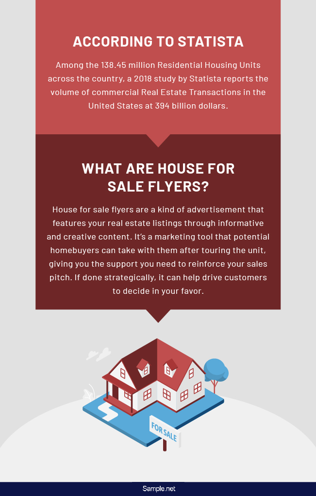
House for sale flyers are a kind of advertisement that features your real estate listings through informative and creative content. It’s a marketing tool that potential homebuyers can take with them after touring the unit, giving you the support you need to reinforce your sales pitch. If done strategically, it can help drive customers to decide in your favor. The flyer may contain vital information about the housing unit, including its location and price. The more people know about your listing, the more leads you get to bring you one step closer to making a sale.
15+ House for Sale Flyer Examples, Templates, Format in Word, PDF
House for Sale Flyers
-
Houses For Sale Flyers
download now -

House Real Estate Sales Flyer Template
download now -

Open House Promotion Flyer
download now -
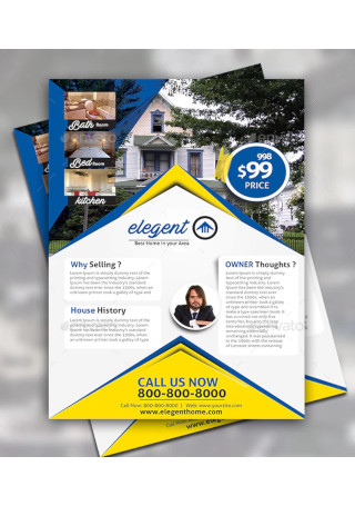
House For Sale Flyer Design
download now -

Real Estate Agent House Sales flyer
download now -
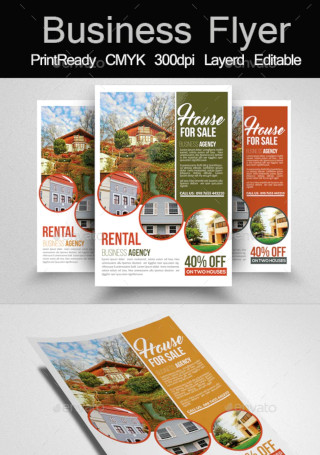
House For Business Sale Flyer Templates
download now -

Sale Purchase Rent Mortgage House Isometric
download now -
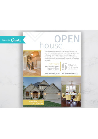
Open House Sales Flyer
download now -

Home for sale flyer poster
download now -
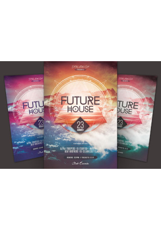
Future House Flyer
download now -
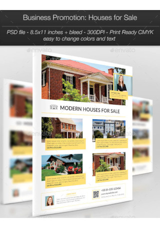
Business Promotion Houses for Sale
download now -

House For Sale And Rent
download now -

Online Sale Rent Mortgage House Isometric
download now -
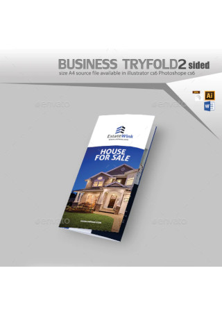
House For Sale Three Fold Brochure
download now
The Benefits of House for Sale Flyers
Flyers are still one of the most prominent players in the print marketing game. As a versatile and cost-effective promotional tactic, even those in the real estate industry may benefit from the use of flyers. But amidst the popularity of their digital counterparts, why should you consider using print flyers to sell housing units?
Let us look at some of the advantages that these flyers have to offer:
How to Design a House for Sale Flyer
While it may sound tempting to jump straight to the design process with no regard for where to begin, it’s not exactly the best strategy for launching your flyer campaign. You don’t need to have the skills of a professional designer to create a marketing flyer that works. But at the very least, you should possess the knowledge of how flyer marketing goes and what you can do to make it count.
With that said, here’s a step-by-step guide to crafting a sales flyer.
Step 1: Plan Out Your Design
What are the qualities of a flyer that excite you? It could be anything from the informative text telling you about a limited offer down to the eye-catching images of the product being sold. Think about the elements of a flyer that people pay the most attention to as it reaches the palm of one’s hand. Conceptualizing your content is a crucial step of the process, as it helps build the foundation of your layout. It gives you an idea of what the flyer should look like based on the interests of your audience and the main objective of your marketing campaign.
Step 2: Look for Relevant Images
In addition to using photos of the house you are selling, it’s also a wise idea to include images that are suitable for your campaign. Thankfully, the web is home to over a million photographs that you can use to enhance the look of your flyer—just be sure to avoid the terrible cliparts and cheesy stock photos that could ruin the flyer’s appeal. It’s essential to use these photos sparingly to avoid a crowded layout.
Step 3: Create a Compelling Headline
Every marketing piece needs a good headline to draw attention. You can position it at a visible location in big and bold letters for emphasis. It must be short, catchy, and memorable for readers to carry with them even after skimming through your flyer. In most cases, advertisers like to use headlines that relate to a problem that the company is willing to solve. It could come in the form of a question or a statement, as long as it’s enough to pique the curiosity of a passerby.
Step 4: Add Your Copy
Assume that your readers know nothing about what you have to offer and why it would benefit them. Any good flyer design would focus on the essentials of an informative piece. Though you don’t want to give away too much information, you still need to make sure that your flyer says enough to encourage readers to respond to it. You can start with a draft of your copy before transferring it to the final layout. Remember to address what’s important to your target readers. Your call-of-action should serve as the main takeaway of your flyer, providing readers with a clear idea of what you want them to do next.
Step 5: Proofread the Written Content
Double-check your output to make sure it’s free of typos and other minor mistakes. You’d be surprised by how often designers overlook these errors because they aren’t careful enough to proofread their content. Mistakes like this can lead to costly do-overs that would delay your flyer production. Bear in mind that it’s always better to be safe than sorry. You can even have someone trustworthy take a look at it to gain valuable input on what you can do to improve your flyer design even further.
The Dos and Don’ts of House for Sale Flyers
Print flyers have always been a successful form of direct marketing. It continues to help businesses promote an event and notify buyers on a special offer, without leaving a dent on the company’s marketing budget. Unfortunately, many designers are guilty of committing mistakes that can often lead to the campaign’s poor performance. Hitting all the right notes with your flyer can be a challenge for many beginners, which is why we’ve compiled a list of things for you to consider when creating your house for sale flyers.
Dos
1. Do create a buyer persona.
Always begin by creating a profile of your ideal customer. This technique puts you on the shoes of a buyer, making it easy for you to determine the elements that appeal to them based on their interests and a defined demographic. It gives you a better sense of the language they speak, the points that motivate them, and the images they can relate to. Your ability to connect with your target audience plays a vital role in the success of your efforts.
By determining the factors that drive them to make a buying decision in your favor, you can obtain higher lead conversions for your flyer campaign.
2. Do make your content sound welcoming.
Gear your promotional flyers to those who are not already planning to avail of your services or to attend your open house. The secret to real estate marketing is to use a welcoming tone that can persuade readers to respond to your call. You’ll also need to refrain from using acronyms or abbreviations that only industry professionals would know. Unfamiliar language can often cause readers to lose interest in your recruitment material, making it difficult for you to carry your message across to your desired audience.
3. Do highlight exclusive deals and offers.
Selling a house is a lot of work. People buy homes as a long-term investment that usually require housing loans that they need to pay off for several years. While you can’t convince a person to buy a housing unit right then and there, you can put that message at the top of their heads by encouraging them to act immediately. One smart approach is to make your special offers prominent in your real estate flyer. Establishing a level of urgency will push customers to get in touch with you sooner than later. It doesn’t need to be anything too extravagant, as you can quickly satisfy buyers with even the simplest incentives.
4. Do organize information in a logical manner.
Flyers need to be readable to convey your message effortlessly. You don’t want to make it difficult for readers to run over your content. Following a logical order of elements should make it easy for readers to find the information they’re looking for in your flyer. The least you can do is break your content down to readable portions as well, given how space somewhat limits the body of your flyer to what’s essential. Adding white space to your layout also helps balance the design to maintain its visual appeal.
5. Do make it easy to digest.
Have you ever heard about the three-second test? In three seconds, readers should be able to grasp the main parts of the advertising flyer, namely your business name, marketing message, and call-to-action. The simpler you keep your content, the more valuable it becomes to your readers. You can use bullet lists, text boxes, and infographics to simplify your paragraphs and ensure readability. Avoid using complicated terms that the average person would need a dictionary to understand, as this would only steer a person’s attention away from your flyer.
Don’ts
1. Don’t forget the necessary details.
It’s often easy for designers to craft a flyer with flowery words and fancy graphics, but forget to add the essentials that matter. These details are what make your flyer useful to customers. If you’re hosting an open house, you want to let people know about the what, when, and where of the event for guidance. Other information may include the price and registration details of the event, if applicable. Visitors may use your flyer for reference if they decide to attend the open house as prospective buyers.
2. Don’t say too much in your flyer.
People don’t always have the luxury of time to read through a wordy letter. Putting too much information in your flyer will make it hard for you to relay your message effectively, causing readers to lose interest in what you have to say. To avoid cramming information into one area, it’s important to prioritize what’s relevant to your marketing objective. You don’t have to make a list of the key services that you offer as a realtor or a seller, as customers will be more interested in the benefits that you can provide them. A little can go a long way when you do it correctly.
3. Don’t go overboard with color.
We all know how color can be a powerful addition to a flyer. But keep in mind that color can also be a deadly weapon that may negatively impact the way others perceive your marketing material. Using vibrant tones might seem like a smart approach to making your flyer stand out, but only later will you realize how this combination can make your flyer seem like a pain to look at. Feel free to experiment with different palettes to see what works best for your flyer design.
If you’re having trouble deciding what to use, you might want to stick with colors that are consistent with your logo and brand image.
4. Don’t settle for low-quality photos.
When making a house for sale flyer, it only makes sense to include photos of the home being sold. Buyers rely on these images to visualize themselves living in the unit if they decide to make the purchase. You don’t want to mislead your prospects by using photos taken from the Internet, so be sure to have your photo roll ready before creating the flyer. High-quality images are a must to impress your audience with the interior and exterior features of the house you are advertising. While this doesn’t mean you need to invest in an expensive camera to take your shots, taking crisp and clear photos of the place will mean the difference between an attractive unit and a boring one.
5. Don’t leave your flyers in the wrong places.
Always consider how you plan to distribute your flyers. Whether you want to hand them out during an event or put them on the windshield of people’s cars, you need to make sure that what you’re doing does not cause a public disturbance. While some people don’t mind receiving a flyer, others will find it annoying. Thus, it’s important to target a specific audience when creating and distributing your flyer to avoid wasting a copy on a cold call.
Let people know that your house is up for sale with the help of a house for sale flyer template! Although projects like this can be quite intimidating for the inexperienced designer, by following the guidelines above, you don’t have anything to worry about. Creating an excellent quality house for sale flyer will give your real estate listing the extra boost it needs to put you another step ahead of your competitors.