49+ Sample Lawn Care Flyers
-
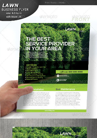
Lawn Care Flyer
-
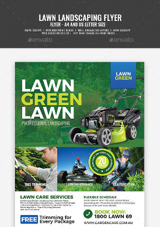
Landscaping and Lawn Care Flyer
-

Sample Lawn Care Flyer
-

Sample Landscaping and Lawn Care Flyer
-
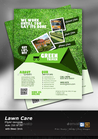
Garden and Lawn care Flyer
-
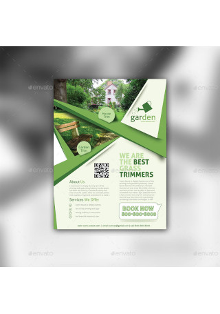
Lawn Care Flyers
-
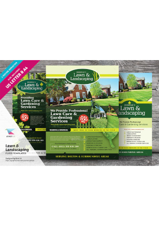
Lawn & Landscaping Flyer Templates
-
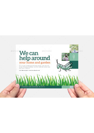
Gardening Flyer Template
-
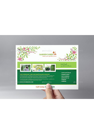
Gardener Flyer Template
-
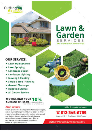
Lawn & Garden Services
-
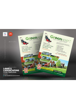
Lawn & Landscaping Flyer Template
-
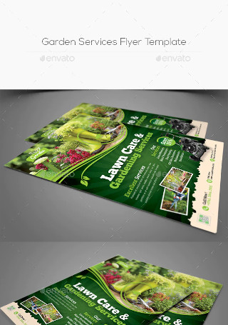
Garden Services Flyer Template
-
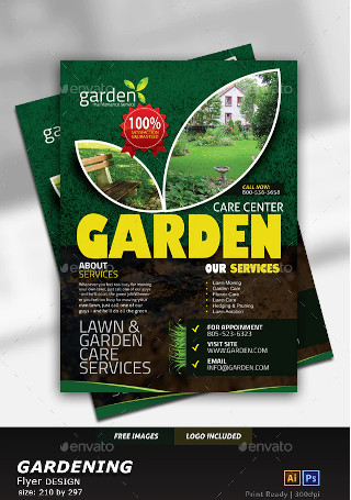
Garden Landscape Flyer
-
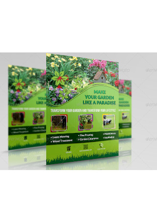
Garden Services Flyer Sample
-
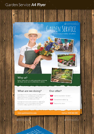
Garden Service Flyer
-
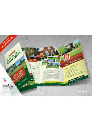
Lawn & Landscaping Trifold and Bifold Brochure
-
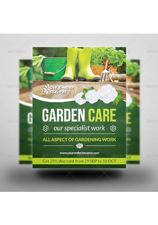
Garden Services Flyer
-
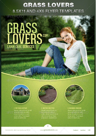
Grass Lovers Corporate Flyer
-

Garden Services Flyer Format
-
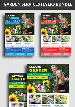
Garden Services Flyers Bundle
-
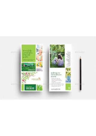
Gardener Rack Card Template
-

Garden Landscape Flyer Template
-

Garden Services Advertising Bundle
-
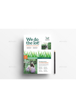
Gardening Poster / Advertisement Template
-
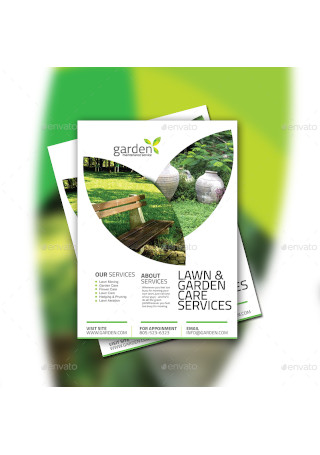
Garden Flyer
-
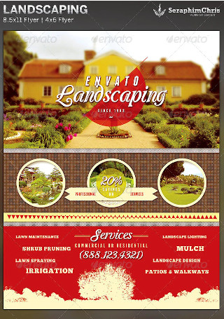
Multipurpose Landscaping Flyer
-
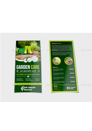
Sample Garden Services Flyer
-
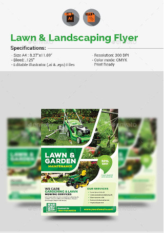
Lawn & Landscaping Flyer
-
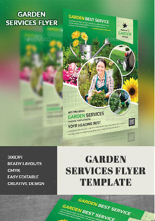
Formal Garden Services Flyer
-
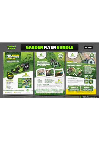
Garden Flyer Template Bundle
-
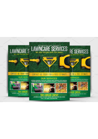
Lawn & Garden Care Flyer Template
-
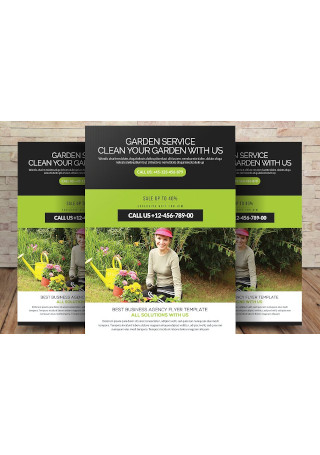
Sample Garden Services Flyer Template
-
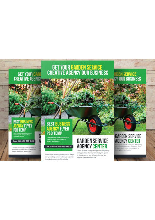
Simple Garden Services Flyer
-
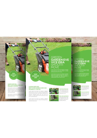
Editable Garden Services Flyer Template
-
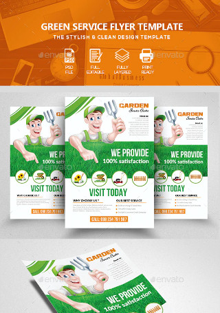
Garden & Plantation Services Flyer Template
-
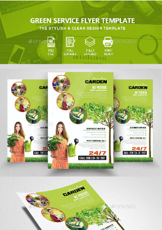
Garden & Plantation Services Flyer
-

Lawn Care Advertising Tearsheet Flyer
-

Lawn Care Promotional Flyer
-

Landscape Lawn Care Business Flyer
-

Lawn Care Marketing flyer
-
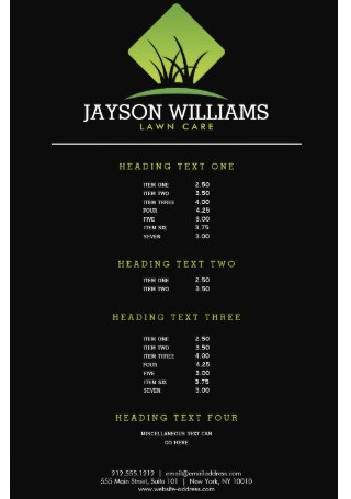
Modern Lawn Care Flyer
-

Carpentry landscaping Flyer
-

Lawn Care Grass Landscaper Flyer
-

Lawn Care Mow Grass Landscaper Flyer
-

Lawn Care Business Flyer
-

Lawn Care Promotion Business Flyer
-
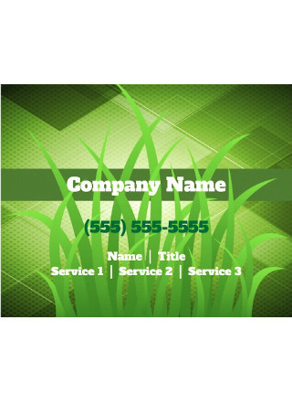
Lawn Care Gardening Landscaping Flyer
-
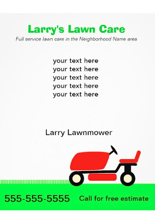
Lawn Care Services Flyer Sample
-

Marketing Flyer Lawn Care Business
-
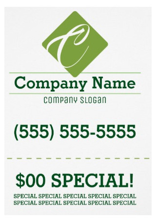
Lawn Care Flyer Invitation
What Is a Lawn Care Flyer?
A lawn care flyer whose purpose is to serve as a promotional tool to let customers know all about your company’s lawn care services. Not only that, but it will also shed light on specific information like the products being used, how qualified the professionals are to use those products, the time and date that customers can avail of these services, and so much more. Due to the intricacies that are involved with lawn care, one can expect these flyers to encompass a comprehensive amount of information in a compact manner. Those interested in creating one for themselves will have their work cut out for them given the elements, steps, and considerations to take into account.
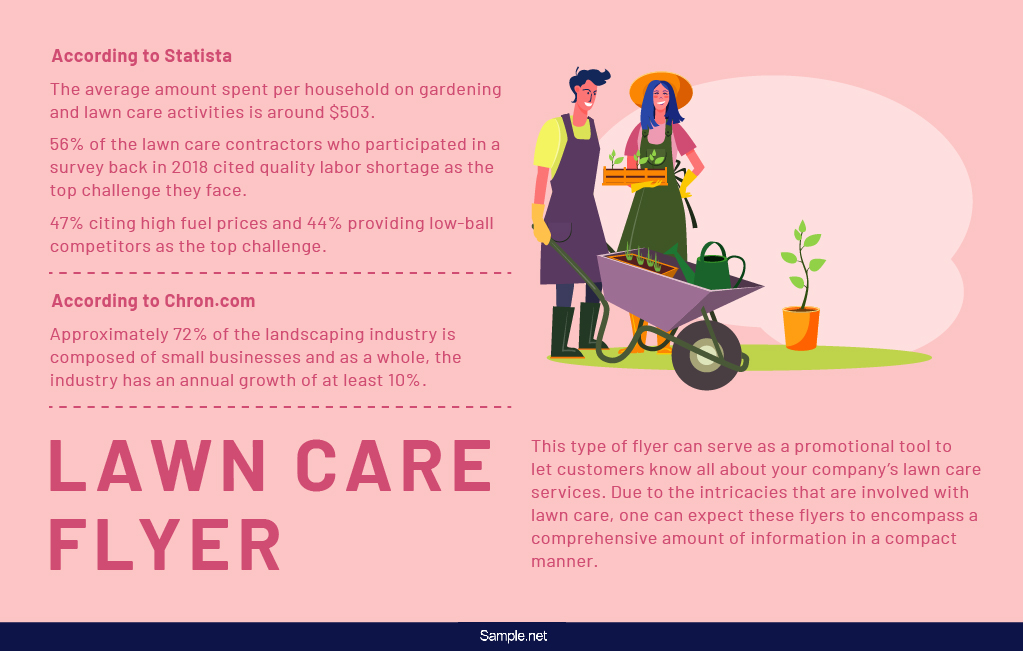
According to Statista, the average amount spent per household on gardening and lawn care activities is around $503. It was also stated by the same source that 56% of the lawn care contractors who participated in a survey back in 2018 cited quality labor shortage as the top challenge they face. This is followed by 47% citing high fuel prices and 44% providing low-ball competitors as the top challenge. According to Chron, approximately 72% of the landscaping industry is composed of small businesses and as a whole, the industry has an annual growth of at least 10%. Considering those stats, there’s a lot you can benefit for your own lawn care business with an excellent flyer at your disposal.
The Elements of a Lawn Care Flyer Template
Regardless of what your flyer depicts, it is essential to take note of the five key elements that will be inevitably present. These are essential in putting together a high quality and purposely effective flyer that is ready to grab on to, and retain, the reader’s attention. Each element is described briefly for your benefit.
How to Create a Lawn Care Flyer
Now comes the part where we zone in on the actual creation process of the lawn care flyer itself. Pay close attention to the general steps provided below. Each one is tailored to take you one step closer to your desired output in a way that is easy and quick. This is something that also applies to any other kind of modern flyer.
Step 1: Download the Right Template
Before you begin writing the text and adding your images, the first thing to be done is get the right template. There are numerous choices online and any of one them can help you with whatever goal or vision you may have. A tip in choosing would be to plan out what you intend the lawn care flyer to look like beforehand. Afterwards, look through the various selections and select the one that already comes closest to your plan.
Step 2: Add Your Images
The second step would be to insert your own images. There are some flyers that may already have their own images and if you want to use those, then it is up to you. However, if you prefer to add an even more personalized touch to your lawn care flyer, then you will need to utilize your own pictures. It could be actual photographs that you took, an imagine you produced, or something that is in between the two.
Step 3: Insert the Text
The third step will involve the writing of the text for your flyer. Due to its nature, you cannot just stick images and call it a day, nor can you just write paragraph after paragraph of texts. When you begin writing, it is recommended that you wisely use the space that is left on your downloaded template. Be warned that it would not be wise to write anything that is too long. Something that is too short may lessen the impact of your message.
Step 4: Make the Necessary Edits
Even though you have already chosen a template that fits naturally into your plans, remember that there is always room for edits. Take a look at what you have created thus far and try to find areas where you can improve. From there, edit everything and make sure that nothing is amiss. Place your images in all the right areas and ensure your texts are on point. After doing all of that, there is only one step left in this entire creation process.
Step 5: Print the Flyer
With everything taken care of, now is the time for you to print out your flyer. You can choose to do so from the comforts of your own home or you can make use of commercial printing services. Alternatively, you can just send your final output to whoever may need it digitally via email. What you do in this step will depend on your specific circumstances along with whatever it is that you are most comfortable doing.
The Dos and Don’ts of a Lawn Care Flyer Template
Even with the steps above, there are additional tips that you may want to keep in mind. In doing so you will add even greater quality to your flyer. Take a look at the following list of dos and don’ts and see where you can apply them to your work.
Dos
Do try to keep things simple.
Lawn care is not a complicated topic and your flyers should be the same. Whenever you can afford to be simplistic about things, do so. It could pertain to your images, for example. There’s no need for anything intricate; go for something that catches attention and does not overwhelm anyone. For your texts, keep them short and as direct to the point as possible. As long as you hit the right notes, there is never a need for you to go beyond simplicity.
Do keep your audience in mind.
When you are involved in any kind of business, it is important to know and understand your audience well. This translates to the creation of your lawn care flyers. Ask yourself questions that involves finding out who they are, what they need, where they live, how old they are, and many more. In doing so, you can adapt and make design decisions that will appeal to your audience in the most effective ways. If you do not keep your audience in mind, you may still end up with a good-looking flyer but there would be no way for you to guarantee its effectiveness.
Do utilize a proper call to action.
Lawn care is an active endeavor that requires the direct involvement of home or land owners. By having a call to action included in your lawn care flyer, you encourage this involvement among your audience. Other reasons to include call to actions, popularly shortened to CTAs, will also include the motivation of your business’ sales funnel and the boosting of your digital advertising’s success rate. Due to its importance and effectiveness, those who intend to ignore CTAs ought to do so at their own peril.
Do have a proper headline.
A proper headline is a must for any flyer because of the useful perks that it can provide you with. It is worth keeping in mind that this is not just the title of your flyer. This also happens to be something your readers can identify with as far as your flyer’s overall content is concerned. You can expect your audience to realize through the headline that your flyer is not only informative, but also quite interesting. When you have a proper headline in place, be assured that your flyer is better received and capable of attracting more people.
Do utilize space wisely.
One of the things guaranteed to turn people off would be cluttered flyers. Space is something that should be utilized to great effect not just for flyers but also for similar or related items such as movie posters. Without proper planning in regards to the spacing, you run the risk of creating a flyer that is overcrowded and unsightly. Do yourself and your audience a favor by striking the right balance–in spite of how difficult that can be–when it comes to what to leave empty and what to fill in with the right images and text.
Don’ts
Do not go overboard with the text.
A flyer is meant to capture the reader’s attention through a mixture of well-placed images and texts. If you go overboard with either one, you run the risk of alienating the reader. Text plays an important part in the overall quality of a flyer but anything more than a minimalist approach may risk over-complicating things. A great advice to follow concerning text is to include only the most relevant information and present them in a way that is as direct to the point as possible.
Do not neglect important details.
Creating a lawn care flyer requires an abundance of important details that you cannot afford to leave out. If you do, by chance, miss a detail or two, then the real loser would be the reader. At best, the knowledge acquired would be incomplete. At worst, the reader continues to be uninformed. As stated by the previous tip, text is to be kept at a minimum, but you still need to ensure that what you do include is essential for your reader’s maximum benefit. Failure to do so will result in a lower quality of flyer, which ultimately reflects badly on you.
Do not utilize paper that is low in quality.
When judging paper for future use, base your choice on its grammage. That is the term used to describe its thickness or the density of the paper. The choice of paper thickness will affect how your flyer looks and feels, so decide based on what your goals are. Concerning lawn care flyers, it is recommended that you make use of 135 GSM flyer paper. It is known for being quite convenient when it comes to distribution since it is lightweight but 1.5 times thicker than printing paper. Using anything that is less dense may lead to output that is not as sturdy and can be prone to wrinkling.
Do not finish in a passive manner.
This is a tip that reinforces the need to include a call to action when it is all said and done. When people look at your flyer’s contents, they will decide within seconds whether or not it is worth their time to proceed further. If you want to make sure that they do, do not wrap things up passively. Come up with something that will continue to pique their interest. Most would comply with this tip with a CTA, which will either encourage the reader to either directly seek out lawn care services or find out more information through the inclusion of contact details or a website.
Do not neglect to proofread before printing.
Whenever you creating something, it is always important to look over it again and again before deciding that it is finalized. The reason for this is because mistakes can be easy to overlook, especially small ones like typos. This applies for documents that consist of all texts, partial texts, or a combination of images and texts like flyers are. You can even double check to see if you used the right images or graphics for your lawn care flyer. Only after you have taken the time to proofread should you decide to print this from home or through commercial services.
As you can see, there’s much to talk about regarding the nuances of a lawn care flyer. Remember that some of the best lawn care flyer templates are ready and waiting to be downloaded by you at your leisure. Each one is guaranteed to please and can be remarkably easy to edit and printable.