29+ Sample Research Posters
-

Science Research and Development Poster
download now -

DNA Strand Poster
download now -

Socialize for Research Poster
download now -

Mad Scientist Poster
download now -

Chemistry Poster
download now -

Genetic Science Research Poster
download now -

Laboratory Glassware Poster
download now -

Cell with DNA Poster
download now -

Genetic Research Poster
download now -

Science Poster
download now -
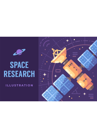
Space Research Poster
download now -

Scientific Research Laboratory Poster
download now -
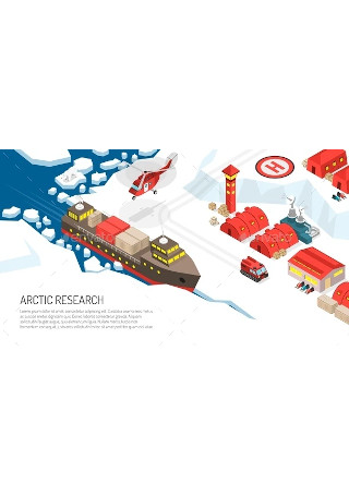
Arctic Research Polar Station Poster
download now -
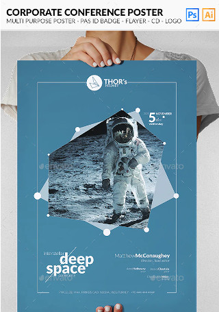
Multipurpose Poster
download now -

Science Poster With Decorative Inscription
download now -

Pharmaceutical Research Poster
download now -

Research Team Art Print Poster
download now -
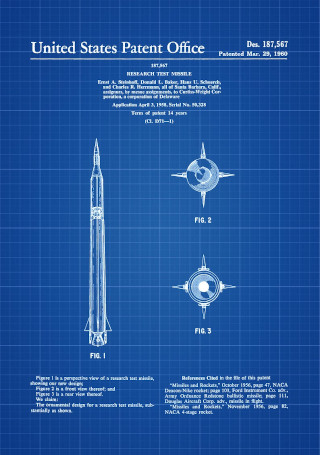
Research Test Missile Patent Print
download now -
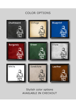
Science Art Print
download now -

Big Foot Shadow Research Poster
download now -

Microbiology Isometric Poster
download now -

Science Poster Illustration
download now -

Medical Healthcare Research Flat Composition
download now -

Research Poster Design
download now -

Research Poster Graphic
download now -
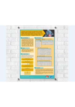
Research Poster Sample
download now -
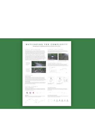
Wayfinding Research Poster
download now -

Ethical Research Poster Design
download now
What Is a Research Poster?
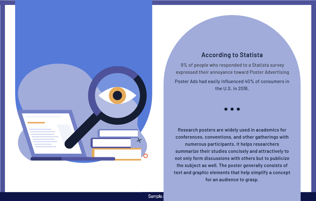
You may recognize posters for how they function in the world of marketing, or how popular they have become that 9% of people who responded to a Statista survey expressed their annoyance toward poster advertising. But there’s more to the medium than the brand posters and movie posters you’ve grown accustomed to, as many people continue to use posters for educational purposes.
Research posters are widely used in academics for conferences, conventions, and other gatherings with numerous participants. It helps researchers summarize their studies concisely and attractively to not only form discussions with others but to publicize the subject as well. The poster generally consists of text and graphic elements that help simplify a concept for an audience to grasp.
Similar to an academic paper, a research poster also contains informative content that readers will find useful in their quest to understanding a topic they know little about. But because it comes in the form of a poster, you’ll likely see less text and more visuals in its layout. A logical and well-designed research poster is sure to make it easy for viewers to comprehend your message in just a few minutes.
The Advantages of a Research Poster
Are research posters worth your time and effort? Statista reports that poster ads had easily influenced 40% of consumers in the U.S. in 2016. In the same sense, people are more likely to believe what’s written in a poster compared to the facts and figures found online. As a researcher, this is an opportunity for you to share your work with the rest of the world creatively. There are other reasons why researchers are encouraged to discuss the details of their study through a poster, and these are as follows:
How to Design a Research Poster
These days, it has become prevalent for students and scholars to exhibit their latest works through the use of a poster. Displaying your research poster in front of your peers can be very intimidating, despite how confident you are about your study. As people continue to scan their eyes across the different poster designs in your aisle, standing out seems almost impossible to do. Fortunately, you could easily overcome this obstacle by exerting some effort into the design process.
Step 1: Draft Your Copy
The most challenging part of designing a poster is finding out where to begin. It’s impossible to get into the process with your eyes closed. Thus, it’s best to start by developing an outline of your study. Note down the essentials along with their supporting data. You can do this by identifying the most critical points and connecting them to maintain a logical flow of ideas. Keep in mind that this is an integral part of the poster that every researcher must prioritize above anything else. Without a detailed copy, the poster will fail to accomplish what it was initially intended to do.
Step 2: Conceptualize on the Layout
Here is where the fun starts. What many people seem to forget is how your layout can either make or break your poster design. Do you have enough panels to section and organize your data? Is your poster of the right size? There are many factors to consider before throwing anything into your layout. You can spare a few minutes of your time to brainstorm on what’s appropriate for your poster design. While you may have to adjust to a couple of changes down the road, at least you have something that you could work with for the meantime.
Step 3: Create Eye-Catching Visuals
Imagine walking around a room filled with research posters, what’s the first thing that catches your eye? You’ll likely feel more drawn to a poster with pleasing colors and recognizable images. These visuals are enough to compel viewers and keep them captivated as you encourage further reading. In most cases, a prominent and thought-provoking image has the power to generate the most attention, hooking people in even from a fair distance. It could be anything deemed relevant to your study yet relatable to your audience.
Step 4: Add the Essential Data
No research poster would ever be complete without the presence of charts, graphs, and tables. Remember that your viewers may only possess limited knowledge about the topic, so putting everything in writing may turn out confusing and slightly overwhelming. Thankfully, you can easily use a graph to translate this data more clearly for readers to understand. It’s also a smart move to apply a specific color scheme that will keep your figures consistent with one another.
Step 5: Have it Ready for Printing
You might think you’re doing yourself a favor by skipping this part of the process, but you have to realize how frustrating it would be to put up a research poster containing the most obvious errors. Lack of time should never be an excuse to sacrifice the quality of your work; therefore, quality assurance and quality control must never be taken for granted.
Once you’re satisfied with the final output, you can have the poster printed and laminated for viewing. Don’t think twice about investing in high-quality printing. Rest assured, it’s worth every penny.
The Dos and Don’ts of a Research Poster
Putting together a research poster is a lot of work. As if drawing people in with your visuals isn’t challenging enough, you also need to make sure that your poster makes complete sense to the people that will view it. So, how can a research poster express your ideas explicitly? Listed below are some tips on what to do and what not to do in research poster design.
Dos
1. Do create a plan.
Research posters are pretty different from your average marketing posters. Instead of advertising a product, service, event, or brand, research posters aim to educate viewers on the specifics of a study. Getting into the design process without proper planning is a recipe for disaster, as you’re bound to produce a poster that says little about what people want to know about your topic. But by having a plan in place, you’ll have enough time to draft, design, print, and laminate your poster.
2. Do review the poster space beforehand.
How are you going to present your poster? If it’s an entry for a conference or convention, you won’t have a lot of space to utilize for your poster. The last thing you’ll want to make is a poster that’s larger than the board allotted for participants. Research poster sizes usually vary depending on how you present them to an audience. Keep in mind that this space will help you determine what to include in the contents of your poster. You can ask the head organizers of the event for details regarding the poster space. It’s also a good idea to do so in order to avoid significant changes down the road.
3. Do consider your audience.
Even if you are presenting the poster to people with a common interest, you can’t expect every single person to understand the basics of your topic. The purpose of a research poster is to share the essentials of your subject clearly and coherently with the most curious minds. But those who show interest in your topic don’t always have enough knowledge to understand what you are trying to get across. For this reason, it’s essential to speak in a language that may be followed by all. Avoid jargon at all costs, but if there’s no way of simplifying these terms, the least you can do is to provide a brief description of the word or phrase for the sake of others.
4. Do make it big and bold.
You don’t want to make it hard for people to read your research poster. Imagine how embarrassing it would be to have people ask for a magnifying glass every time they take a look at your poster!
Readability is crucial in any print material. You’ll want to make sure your text elements stick out by using the right font size and style. While it isn’t necessary to master the art of typography, it does help to learn a thing or two about the rules of good typography before you begin crafting your poster.
5. Do keep it visible from a distance.
When displaying a poster at a crowded venue, you’ll be competing with a dozen other visuals to capture a person’s attention. The goal here is to get people to notice your poster through its captivating content. Thus, you need to make it easier for people to read what’s written in your research poster by using legible fonts and more explicit illustrations. It won’t hurt to print a tester version to assess whether your poster remains visible even from afar.
Don’ts
1. Don’t make information hard to find.
During the planning stage of the process, always consider how you wish to present the details of your study in the poster’s layout. It’s crucial to organize your content in a manner that is both readable and understandable. Following a logical flow of information is one way to boost readability and strengthen engagement. You can also utilize charts and graphs to summarize data more accurately. Those reading your poster can quickly refer to the information emphasized in these tables for easy comprehension.
2. Don’t overcomplicate its appearance.
A research poster is typically more formal in tone compared to the average posters you see around you. That’s because research posters are meant to inform readers about the problem, method, and results of a study for educational purposes. This is one of the main reasons why you only need to highlight what’s necessary. Everything from the tabulated data to the images in your poster must be pertinent to your primary objective. Keeping it as simple as possible will stop you from unintentionally obscuring your message.
3. Don’t cram too much in.
There’s nothing worse than a cluttered poster layout. Not only is it a nightmare to look at, but it also makes it impossible for readers to grasp the points you want to deliver. An easy but effective technique is to make your poster concise and easy to follow. This means eliminating unnecessary elements from your content and leaving behind only what’s relevant to the topic. If there’s a lot of data from your original copy of the lab report or business report that you want to include, the best you could do is to break this information down to digestible parts.
4. Don’t go overboard with colors.
Colors are an excellent addition to your poster—to a reasonable extent, that is. Too much color can make it difficult to read, while too little color can also make your poster boring to look at. Instead, you need to use colors sparingly to balance it out. It’s best to avoid a black-and-white mix as well as extremely bright colors, as the latter will only make your poster stand out for all the wrong reasons. Try experimenting with different color combinations to find out what complements your poster design the best. Be wary of colors that could affect the readability of your text as well.
5. Don’t forget to run through it before printing.
Remember to proofread your copy and check for any design errors that require immediate correction. It’s vital to review the entire poster before getting it printed to prevent costly mistakes you know you’ll end up regretting. You can try leaving it for a couple of hours so you could run over it again with a fresh pair of eyes. You can even have a friend check your poster for another round of review and a second opinion on what you can do to improve its appearance.
Although there’s nothing more important than addressing the actual study in your research poster, it won’t hurt to spare some time and effort to create a poster design that will resonate well with your audience. A good research poster is bound to not only educate readers on a topic but also give them something to remember. And now that you’ve learned the basic principles of designing a research poster, you’re on your way to making a poster that’s worth the attention.