39+ Sample Flyers
-
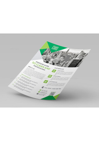
Flyer
-
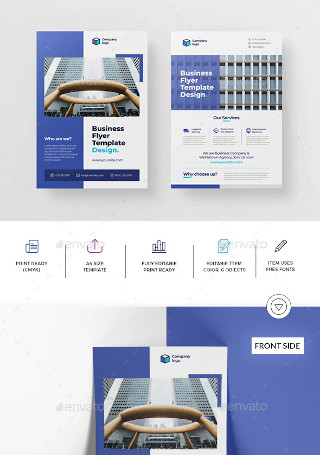
Business Flyer Template Design
-

Birthday Flyer
-
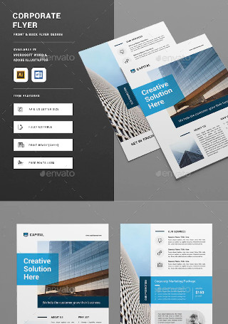
Sample Corporate Flyer
-

Party Flyer
-
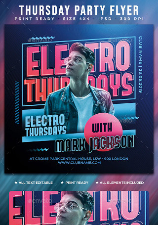
Thursday Flyer
-

Halloween Flyer
-
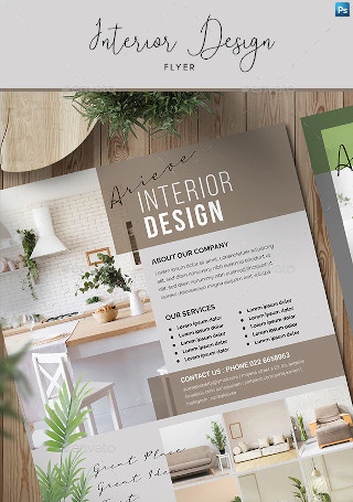
Simple Interior Design Flyer
-

Fashion Design Flyer Template
-
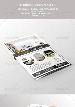
Interior Design Flyer
-
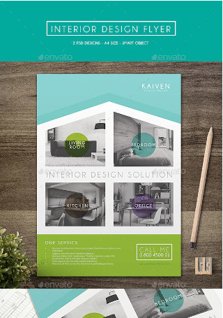
Sample Interior Design Flyer
-
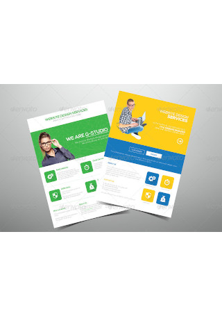
Flat Website Design Flyer
-
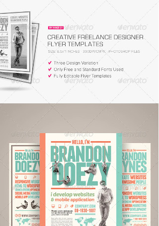
Creative Freelance Designer Flyers
-
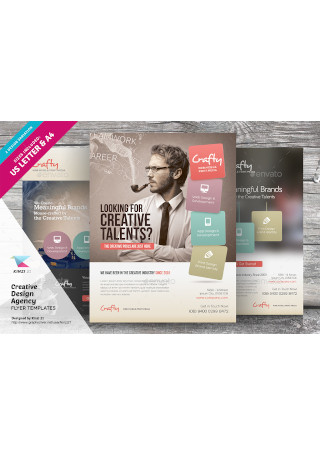
Creative Design Agency Flyers
-
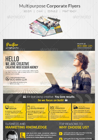
Design Agency Flyers
-
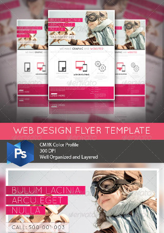
Web Design Business Flyer
-
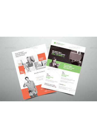
Creative Design Company Flyer
-
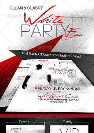
White Party Event Flyer
-
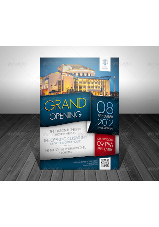
Grand Opening Event Flyer
-
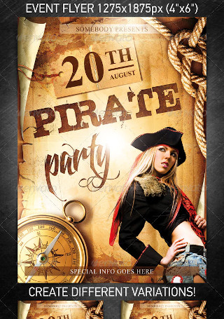
Pirate Party Event Flyer
-
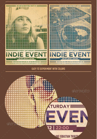
Indie Event Flyer/Poster
-

Motorcycle Event Flyer
-

Christmas Event Flyer Template
-
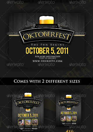
Oktoberfest Event Flyer Template
-
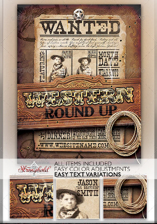
Wild West Event Flyer
-

Nightclub Event Flyer
-

Multipurpose Sports Event Flyer
-

Event Flyer Template
-

Premium Real Estate Flyers
-

Real Estate Flyer Template
-

Better Real Estate Flyer Template
-

Modern Creative Flyer
-
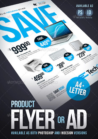
Product Flyer / Ad
-
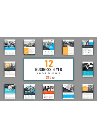
Business Flyer Bundle
-
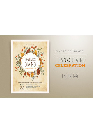
Thanksgiving Flyers
-
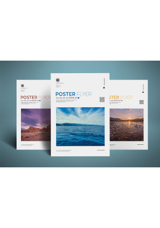
Realistic Poster and Flyer Mockup
-
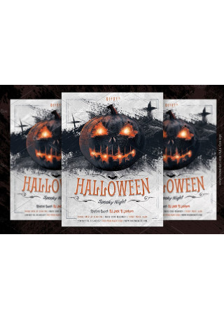
Halloween Party Flyer Template
-
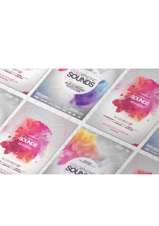
Elegant Flyer Mock up
-
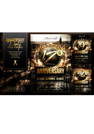
Anniversary Flyer Template
-
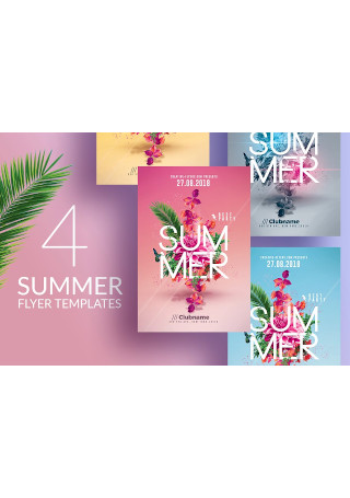
Summer Party | 4 Flyers Templates
What Is a Flyer?
We define a flyer as a form of paper advertisement generally distributed to target audiences through handouts, inserts, or direct mail. It’s a channel that allows businesses to promote their brand and product or service offers clearly and creatively enough to stand out among competitors. It can even serve as a supporting tool to help sales representatives spark a conversation with potential buyers. This will guide a person through the sales cycle and into the final stages of helping a business generate a profit. By captivating and engaging consumers, you can easily deliver your marketing message with the least amount of effort required.
The Benefits of Using a Flyer
What makes a flyer a preferable marketing medium is its versatility. Businesses of all scales and specialties have been using flyers as a key part of their print marketing efforts for years. It’s not something that businesses have to break the bank to initiate, as flyer production is known to be extremely affordable for all. Even with the continuous advancements in technology, flyer campaigns have proven to withstand the test of time thanks to the simplicity of its purpose. Several other reasons drive marketers to invest in a flyer campaign, such as those listed below.
How to Design a Flyer
When you are marketing on a budget, hiring a professional graphic designer isn’t always an option. The do-it-yourself method might seem like an intimidating alternative, but it’s only natural to feel pressured when the responsibility of it all rests firmly on your shoulders. While there is never a guarantee of success, your flyer can still make an impression that will stick with your audience from the very start. Slim down the chances of making a flyer that customers will choose to dismiss with the help of the steps below.
Step 1: Create a Draft of Your Content
A flyer is often more informative than an average poster. This is one of the reasons why it’s vital to begin the design process by planning your content before throwing everything in. You can start by creating an outline of information containing the title, subtitle, and description of your main message. A strong headline should draw a person’s attention at first glance. It must be powerful enough to give customers a reason to continue reading what your flyer has to say, without giving away too much information about what is advertised. Don’t worry about not being able to impress everybody, as what matters is your ability to connect with people of specific interest.
Step 2: Emphasize What’s Necessary
Once you have a plan in place, it’s time to make a hierarchy of elements that matter down to those that you could do without. In this case, your text elements play a significant role in the delivery of your message. Titles must be striking enough to get people to look, while the rest of your text should blend in perfectly to please the eyes. So in this step, dedicate some time to play around with typography. See what works and what doesn’t in this case. Your knowledge and application of typography can greatly influence the flyer’s readability, not to mention the emotion it brings to a viewer.
However, you also want to be careful about overdoing it. The last thing you’ll want to do is overwhelm your audience with bold fonts that appear to clutter your layout rather than compliment it.
Step 3: Position Your Elements
Balance is crucial in design. It draws the line between a clean-cut content and a messy layout. The placement of each element can also affect its function. For example, positioning your contact details on the corner of the page in fine print will make it difficult for readers to locate. You need to form borders, lines, or grids when designing to properly assess the areas that would be the most noticeable to your audience.
Step 4: Add Details that Stick Out
When it comes to marketing, details are everything. What you put into your flyer can affect how customers react to it. Flyers aim to communicate a message to readers and to persuade them to act immediately. Apart from text elements, you also want to consider including relevant images of the product, service, or event you are promoting. It won’t hurt to add a few shots from your previous launch parties or store openings to entice customers and ensure a positive turnout. Another way to emphasize certain points is to present them in bullets and short sentences. You don’t want to make it hard for people to grasp your message, so you might as well focus on making things efficient to your target audience.
Step 5: Review and Revise
Never take this step for granted. You’d be surprised by how common it is for companies to forget to review their flyers before moving forward with printing. It’s always wise to double-check your content to see if you’ve done everything right to prevent costly mistakes that are often irreversible. Spelling and grammar errors can be an eyesore, along with simple typos that could change the meaning of a message or make it impossible for customers to get in touch with you. Thus, you’re better off safe than sorry.
The Dos and Don’ts of a Flyer Design
Flyers can do wonders for your business if you get them right. But just because it’s simple doesn’t mean it’s easy. Many companies fail to utilize flyers effectively, which is often a result of poor planning and execution. If you want the best, you need to make sure you’re taking the appropriate measures to attain satisfactory results. With that said, you might want to keep the following flyer design tips in mind.
Dos
1. Do consider your audience.
Design for your customers, not for your company. It’s pointless to design a flyer that impresses your supervisor, division manager, and company president, but not your target customers. Marketing campaigns are meant to form a connection with consumers through the different elements that it contains. Thus, it’s always essential to keep your audience in mind when deciding how your message should be delivered to the readers or viewers of your flyer. This will help you garner maximum results with your advertising approach.
2. Do choose fonts carefully.
Fonts can mean the difference between a successful flyer and a dismissive one. A rule of thumb is to limit the number of fonts you use by choosing no more than three different fonts for the heading, subheading, and body of your content. A busy and unpolished output can easily be avoided when you’re consistent with the way you apply your fonts. It’s best to dig deeper into the topic of typography to properly understand what the best techniques could be used to your text to improve your flyer’s overall layout.
3. Do make an effort to keep it unique.
Imagine the number of people handing out advertising flyers the same way you are on a Saturday afternoon. But instead of accepting your event flyer, they’ll assume it’s another laundromat flyer like the one they received two seconds ago. People will end up declining your flyer as you hand it over to them, or worse, feel the need to walk two steps faster to ignore your attempt to make a sales pitch. Scenarios like this can easily be avoided by crafting flyers that are the right kind of different. You can explore different flyer shapes, colors, and textures to find out what might interest your audience.
4. Do have fun with illustrations.
When it comes to both print and digital marketing, visuals have the power to impact your audience in ways mere text cannot. This includes drawings, comic strips, and doodles that help convey your message a lot clearer to readers. It’s also a creative way to relate with people through pure entertainment. However, remember to think twice before hiring or allowing an artist to do the work, as you don’t want the illustration to send a cryptic message to readers who might take it the wrong way.
5. Do include incentives.
A smart way to entice prospects to respond favorably to your ad is to offer special incentives that you know they wouldn’t be able to resist. It doesn’t need to be anything too lavish that could force you out of business. Promo codes, discount vouchers, and free product or service stubs don’t only drive traffic to your business, but also create a buzz for referral marketing. This creates a sense of urgency as well, prompting customers to avail themselves of a particular product or service within the redemption date or until supplies last.
Don’ts
1. Don’t rely on overused stock images.
If you can’t afford to organize a photo-shoot to promote your small business, you can always look for free or affordable stock images online. Many of these images have been used excessively by other companies, so make sure to look carefully before making your final call. It’s nothing to be alarmed about, as the Internet offers a wide range of images for every setting you can imagine.
2. Don’t settle for boring headlines.
If you want to stand out, you have to be compelling enough to get people to notice. For instance, a business flyer has a better chance of garnering attention if you use a headline that addresses a problem or a need. It can be in the form of a question or a phrase, depending on what best suits your marketing objective. Incorporating different design elements to emphasize your headlines is another technique you can use to evoke an emotional response from your viewers. However, ensure you don’t cross any boundaries that could overshadow the rest of the flyer’s key components.
3. Don’t get too obsessed with design trends.
While a modern flyer may resonate well with most people, you don’t want to get too caught up in the idea of making it “hip” or “in style” if it fails to speak volumes about your brand. Individuality is still crucial, regardless of the circumstance. Many marketers make the mistake of following the latest trends that they often ignore the value of staying true to their brand. This goes beyond the colors incorporated into the flyer design, but the material, theme, and overall essence of the print or digital ad as well.
4. Don’t assume effects are always necessary.
Would making your flyer a three-dimensional design put all the two-dimensional flyer designs of your competitors to shame? It depends. Keeping it simple often proves to be a better option as opposed to taking it to another level of extravagance. Try not to go overboard with your design, as this may steer readers away from the central message of your flyer. Effects add an extra bit of fun to your design—that is, if they are applied appropriately. You don’t want the design elements of your flyer to overpower the material’s overall function. Instead, focus on making your flyer design attractive yet readable.
5. Don’t sacrifice quality for savings.
Business owners typically allocate a strict marketing budget to avoid overspending. But staying on a budget doesn’t mean you’re forced to settle with the lowest-quality materials in the market. Paper stock can have a massive impact on the way customers perceive your business. Not only does it affect the lifespan of a flyer, but it also changes the impression that the receiver may have toward the ad. The flyer must reach the hands of its recipients in perfect condition with the help of sturdy paper material.
Flyer distribution is a fast and cost-efficient way to get your business message across to a targeted group of people. It draws awareness toward your brand and keeps customers sufficiently informed on matters concerning your product or service offers. So if you’re looking for an easy way to promote your business, it won’t hurt to add a flyer into the marketing mix.